Transforming Figma to WordPress is an exciting journey in web design, and at the heart of this adventure lies the vibrant world of color theory. Colors do more than just dazzle the eyes; they stir emotions, guide actions, and bring a website to life. Think of colors as the unspoken language that whispers brand values and enhances user experience.
By harnessing the power of color, web designers craft experiences that captivate and engage. So, join us as we dive in and discover how the magic of color theory turns Figma designs into WordPress sites, making them both beautiful and actionable.
What is Color Theory?
Color theory is the science and art of using color. It explains how humans perceive colors, how colors mix, match, or contrast with each other, and the subliminal messages they communicate.

In the context of web design, color theory provides guidelines for choosing color palettes that enhance user experience and optimize them for specific responses. Color theory encompasses:
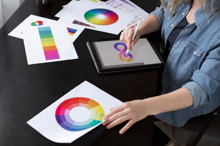
The Color Wheel
The color wheel is a circular graphic that displays the relationships between colors. It’s divided into primary colors, secondary colors, and tertiary colors. This tool is fundamental for understanding color theory and creating harmonious color schemes.
Color Properties and Meanings
Hue represents the basic color on the wheel. Saturation refers to the intensity or purity of the color. Luminance indicates the brightness or lightness of a color. Grasping these properties is crucial for crafting effective color combinations and schemes. Next, warm colors range from red to yellow.
They evoke feelings of energy and coziness. Cool colors, from blue to green and purple, convey serenity and calmness. Knowing these helps in creating balanced color harmonies and schemes.
Color Harmony and Schemes
Color harmony is about how colors combine to create visually pleasing effects. Principles include complementary, analogous, and triadic color schemes.
Understanding these is vital for forming successful color combinations. The Blue-Green Color Scheme is a specific type of analogous color scheme. It includes blue, green, and yellow-green. Common in nature photography, it produces a soothing and harmonious visual flow. Blue-green schemes evoke feelings of calmness and serenity.
Color Context
Color context refers to how colors interact with each other, and with shapes in a design. The perception of a specific color can change depending on its surrounding colors.
For instance, a red object on a blue background may appear differently than on a yellow background. This interaction can affect the overall balance and harmony of a design.
Designers use color context to emphasize certain elements or to create visual hierarchies. Understanding how colors and shapes influence each other is crucial for creating cohesive designs that direct user attention in desired ways.
Psychological Effects
Colors have a profound psychological impact, influencing mood, emotions, and even behavior. For example, blue is often associated with tranquility and trust, making it popular in corporate designs. Red can stimulate energy and urgency, commonly used in sales and promotions. Meanwhile, green is linked to nature and calmness, and it is frequently used in health and environmental contexts.
These psychological effects are taken into account when designers choose color palettes, ensuring they evoke the right emotions and support the intended message of a site or product.
By leveraging these effects, designers can enhance user engagement and emotional connection to the brand.
Read: Figma for Students Empowering the Next Generation of Designers
An Overview on Primary, Secondary, and Tertiary Colors
The color wheel is a foundational tool in color theory, helping designers understand the relationships and interactions between colors. At the core of this wheel are three categories: primary, secondary, and tertiary colors. Mastery of these categories aids in creating dynamic and harmonious design compositions. Let’s explore each category to understand their roles and characteristics.
What Are Primary Colors?
Primary colors are the building blocks of all other colors. They include red, blue, and yellow. These colors cannot be created by mixing other colors together. Instead, they serve as the source from which other colors are derived. In artistic and design contexts, primary colors are used to mix and create a broad spectrum of colors, forming the basis for secondary and tertiary colors.
What Are Secondary Colors?
Secondary colors are formed by mixing two primary colors in equal parts. The three secondary colors are green, orange, and purple. For instance, mixing blue and yellow yields green, red and yellow produce orange, and red and blue create purple. These colors are important for adding depth and variation to a design palette and are used to create more complex color schemes.
What Are Tertiary Colors?
Tertiary colors arise from mixing a primary color with a neighboring secondary color. This results in six tertiary colors: red-orange, yellow-orange, yellow-green, blue-green, blue-purple, and red-purple. These colors offer nuanced hues that can bring subtlety and richness to a design. Tertiary colors allow for more sophisticated and varied color palettes, enabling designers to achieve exact shades needed for harmony or contrast in their work.
Learn: Unlimited Figma to WordPress Conversions for Busy Digital Agencies
Difference Between Traditional Color Theory vs Modern Color Theory
Traditional color theory is based on the color wheel and the mixing of primary pigments: red, yellow, and blue. It emphasizes the creation of secondary and tertiary colors through subtractive mixing.
Modern color theory, on the other hand, incorporates the RGB (red, green, blue) model used in digital screens and the CMYK (cyan, magenta, yellow, key black) model for printing. Modern theory focuses on additive color mixing, where combining light colors creates white, providing a broader understanding of how colors interact digitally and in print.
Importance of Color Theory in Design
Understanding color theory is essential for creating cohesive designs. Color influences perception and can convey messages without words. It affects readability, highlights essential elements, and can direct a user’s focus. Designers leverage color theory to ensure their designs are not only visually appealing but also functional and effective in communicating intended messages.
Psychological Impact
Colors evoke emotions and can affect user behavior. For example, blue can evoke trust and calmness, making it suitable for corporate websites. On the other hand, red can invoke urgency or excitement, often used in sales or promotion contexts. By understanding these psychological impacts, designers can craft compelling user experiences that drive engagement and conversions.
User Experience (UX)
Effective use of color improves the user experience by guiding users through a website intuitively. Good color contrast enhances readability. Consistent color schemes contribute to familiar and comfortable navigation, enhancing overall user satisfaction. By adhering to color theory principles, designers can craft UX interfaces that feel seamless and natural.
Cultural Significance
Colors carry different meanings across cultures. Designers need to be aware of these cultural nuances to avoid misinterpretation. For instance, white symbolizes purity in Western cultures but can signify mourning in some Eastern cultures. Understanding these cultural connotations ensures that color choices resonate appropriately with diverse audiences.
Know more: Common Pitfalls to Avoid for a Smooth Figma to WordPress Conversion
Branding and Identity
Color plays a crucial role in brand identity. Specific colors can make a brand instantly recognizable and distinguishable from competitors. Consistently using brand colors across all platforms helps reinforce brand identity and loyalty, making it easier for customers to connect with the brand’s values and mission.
Accessibility
Color theory also involves making designs accessible to all users, including those with visual impairments. Designers should use color contrast ratios that meet accessibility standards to ensure readability and usability. This approach not only broadens the audience reach but also demonstrates inclusivity, enhancing the website’s appeal and functionality for everyone.
Learn about: Design Accessibility to Ensure Figma Designs Translate Well to WordPress
Figma to WordPress Conversion Process
The transition from a Figma design to a WordPress site involves several technical steps that need careful attention to detail. During this process, the preservation and application of color choices become crucial in maintaining the visual integrity of the design.
Maintaining Design Integrity
Translating a design’s color palette from Figma to WordPress requires an accurate reproduction of colors and effects. This involves:
- Color Codes: Ensuring the same hexadecimal or RGB color codes are used in WordPress as in Figma.
- CSS Manipulation: Utilizing CSS to apply the correct colors and styles across the WordPress theme.
- Visual Hierarchy: Maintaining the same visual hierarchy by using colors to highlight primary, secondary, and tertiary elements as originally intended in the Figma design.
Read: Tips for Ensuring High Conversion Rates When Converting Figma Designs to WordPress
Tools and Techniques
Using tools and plugins can streamline the conversion process:
- Color Picker Tools: Help in quickly transferring correct color values.
- Design System Plugins: Ensure consistent application of color styles across various sections of a website.
- Custom CSS: Allows for precise customization when default WordPress features fall short.
Top Picks: Best Figma to WordPress Conversion Tools
Strategies for Effective Color Use in Figma to WordPress Conversion
Incorporating color theory effectively requires strategic planning and execution.
Here are some strategies to consider when converting Figma designs into WordPress:
- Consistent Branding: Ensure that color choices align with the brand’s identity. This includes using brand-approved colors and maintaining coherence with existing marketing materials. Consistent branding across all platforms enhances brand recognition and trust among users.
- Enhanced Readability: Choose color combinations that maximize readability. Contrast is key here; ensure there is a sufficient difference between text and background colors. This consideration is crucial for accessibility, ensuring that all users, including those with visual impairments, can engage with the content.
- Use of White Space: Balance colors with white space to avoid overwhelming the user. Effective use of space helps in highlighting key content and making the website look organized and clean. White space, combined with strategic color use, can improve the aesthetic appeal and usability of a website.
- Responsive Design: Colors may appear differently on various devices due to screen settings and lighting conditions. Testing color schemes across devices ensures that the intended visual aesthetic is preserved, providing a consistent experience for all users.
Best Tips for: Responsive Design in Figma
Conclusion
Color theory is a powerful tool in web design, particularly when converting Figma designs to WordPress websites. By understanding and applying color theory principles, designers and developers can create visually appealing, user-friendly websites that convey the right message and enhance user engagement.
Ultimately, the careful consideration of color can lead to improved user experience, increased engagement, and better conversion rates. As such, color should never be an afterthought in the design-to-implementation process but rather a core aspect that receives due attention and expertise.
FAQs About Color Theory
What is the role of color theory in web design?
Color theory is crucial in web design as it influences how users perceive the website. It affects the mood, readability, and usability, guiding the user’s attention and enhancing their overall experience.
How can I ensure color consistency from Figma to WordPress?
Use color codes like hexadecimal or RGB values to maintain consistency. Employ tools like color pickers and design system plugins to ensure the same colors and styles are applied in WordPress as intended in your Figma design.
Why is color contrast important in web design?
Color contrast significantly impacts readability and accessibility. High contrast improves text legibility and helps visually impaired users by providing clear distinctions between elements on a page.
How do I choose a color palette for my WordPress site?
Start by considering your brand colors and the emotions you wish to evoke. Use color harmony rules, like complementary or analogous schemes, to create balanced and visually appealing palettes.
What are the common mistakes to avoid regarding color use in web design?
Common mistakes include using too many colors, neglecting contrast for readability, ignoring accessibility principles, and failing to test color schemes across different devices.
How to get blue-violet and blue-green?
To get these two colors, use this:
- Blue-Violet: Mix blue with a small amount of red to create a shade that sits between blue and violet on the color wheel. Adjust the mix to achieve the desired hue intensity.
- Blue-Green: Combine blue with a small amount of yellow to produce blue-green, also known as teal or cyan. This mixture will give you a color that lies between blue and green.
What are warm and cool colors?
Warm colors include red, orange, and yellow, and are associated with warmth, sunlight, and energy. They are often used to create a sense of coziness and excitement.
Cool colors encompass blue, green, and purple, and evoke a sense of calm, serenity, and relaxation. Cool colors are typically used to create a soothing and spacious feeling.
What is subtractive color mixing?
Subtractive color mixing involves combining pigments, dyes, or inks, where each color absorbs (or subtracts) certain wavelengths of light and reflects others. This method is used in traditional painting and printing, where combining primary colors (cyan, magenta, yellow) results in secondary colors and, ultimately, black when all are mixed in equal proportions.
What is complementary color mixing?
Complementary color mixing involves pairing colors that are opposite each other on the color wheel, such as red and green or blue and orange. When placed side by side, these colors create strong visual contrast and can make each other appear more vibrant. Complementary colors are commonly used to create dynamic and visually striking designs.