

The journey from Figma designs to a fully functional website involves bridging the gap between creativity and code. While Figma empowers designers to craft stunning designs, translating those designs into HTML code is essential for web development. In this comprehensive guide, we’ll walk you through the process of converting Figma designs to HTML code. Plus, we will explain how you can seamlessly integrate the HTML code into a WordPress website.
Whether you’re a designer looking to expand your skill set or a developer seeking to translate designs into a website, this Figma to WordPress guide will equip you with the knowledge and tools needed for success.
1. Steps to Convert Figma Designs to HTML Code
Converting Figma designs to HTML code can be a comprehensive process, but with a systematic approach, it becomes manageable. Here’s a detailed expansion of the steps involved:
Export Assets from Figma
Start by identifying the visual assets you need from your Figma design, such as images, icons, and illustrations. Use Figma’s export feature to save these assets.
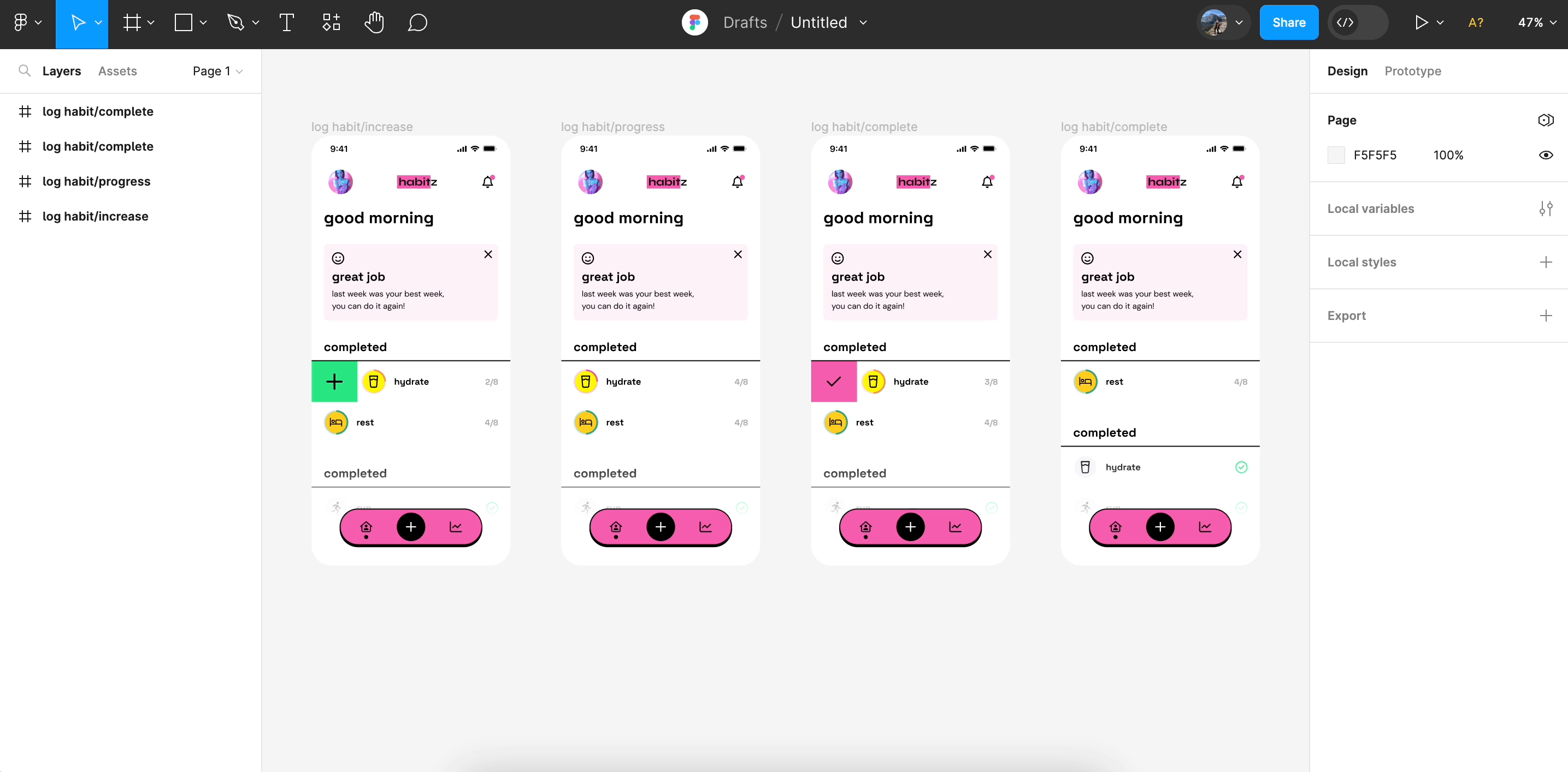
Pay attention to the file formats; for example, use PNG or JPEG for raster images and SVG for vector graphics to maintain quality. Organize the exported assets in a dedicated folder within your project directory for easy access.
Set Up Your Development Environment
Create a new project folder on your local machine to store your HTML, CSS, and JavaScript files.
If you’re using a code editor like Visual Studio Code, set up your project workspace. Consider installing extensions like Live Server, which allows you to run a local server and gives you instant feedback on changes.
Also, consider using SASS or a CSS preprocessor to streamline your styling process. This makes managing CSS in large projects easier.
Structure the HTML
Open your text editor and create a new HTML file. Analyze your Figma design to determine the content structure and start building your HTML using semantic tags. This not only enhances accessibility but also improves SEO.
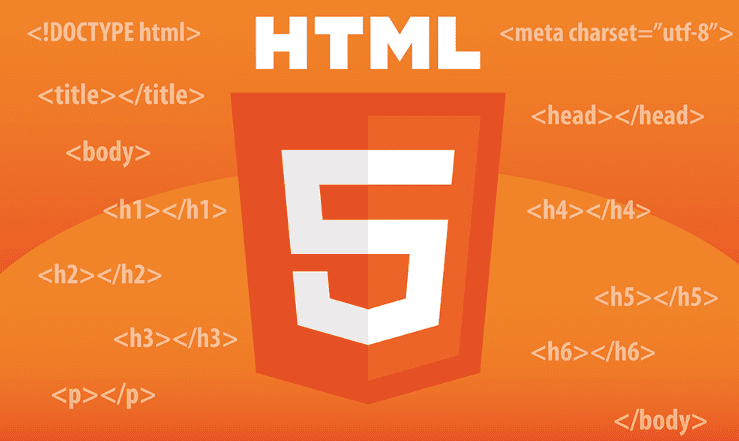
For example, if your design has a navigation menu, wrap it in a <nav> tag. Use <header> for the top section, <section> for distinct parts of the content, and <footer> for the bottom of the page.
Create the CSS Styles
Create a CSS file and link it to your HTML document in the section.
Begin styling your HTML elements by referring to the styling parameters provided in the Figma design. This includes setting the font types, colors, spacing (margins and padding), and positioning.
Leverage CSS Flexbox or Grid to create complex layouts. These tools make it easier to design responsive and flexible structures that adapt to different screen sizes.
Implement Responsive Design
Use media queries to ensure that your design is responsive. Test your layout on different screen sizes and tweak the CSS so that elements reflow and resize appropriately.
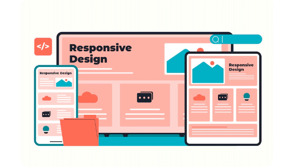
Pay special attention to aspects like font sizes, margins, and container dimensions, as they might need adjustments to fit smaller screens adequately.
Add Interactivity with JavaScript
To add interactivity to your design, create a JavaScript file and link it to your HTML document. Implement dynamic features such as dropdown menus, modals, carousels, or form validations.
JavaScript frameworks or libraries like React or jQuery can be used if your project requires more complex functionality. Test the interactivity thoroughly to ensure all features work seamlessly across different browsers.
Test and Debug
Use browser developer tools, available in browsers like Chrome or Firefox, to test your code. These tools can help inspect elements, debug JavaScript, and monitor network requests.
Ensure the design is consistent with the Figma prototype. Verify design accuracy, such as font sizes, colors, and layout spacing.
Check responsiveness across various devices and rectify any issues. Gather user feedback to identify any unnoticed design or functionality errors.
By following these detailed steps, you can effectively transform your static Figma designs into a dynamic and responsive HTML webpage. Remember, the key is to remain organized and methodical throughout the process, testing and refining each stage to ensure the final product meets your desired quality and functionality standards.
Learn: Tips and Tricks for Figma to WordPress Conversion
2. Building a WordPress Website: Follow These Steps
Building a WordPress website after converting your static designs into a dynamic and responsive HTML webpage is a strategic and structured process. Here’s a detailed guide on how to proceed:

Prepare Your Hosting Environment
First and foremost, choose a reliable hosting provider. Popular options include WP Engine, DreamHost, and Hostinger, which offer easy WordPress installations.
Register your domain name if you haven’t already. Many hosting providers bundle domain registration and hosting for convenience.
Once your hosting account is set up, use the control panel provided to install WordPress. Most hosts offer a one-click WordPress installation process.
Set Up WordPress
Upon installation, log in to your WordPress dashboard.
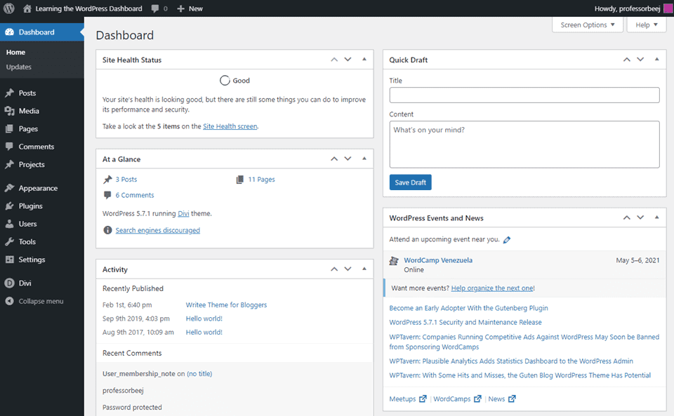
Familiarize yourself with the interface, especially key areas like posts, pages, and settings. Update your WordPress settings. This includes setting your site title, description, and permalink structure for SEO-friendly URLs.
Choose and Install a WordPress Theme
Decide whether to use a pre-made theme or to convert your HTML design into a custom theme. For custom themes, you’ll need basic knowledge of PHP and WordPress theme structure.

If opting for a pre-made theme, explore the WordPress theme repository or marketplaces like SeaThemes to find a theme that matches your design requirements.
Install your chosen theme by navigating to the Appearance ⟶ Themes section in the WordPress dashboard. Once installed, activate the theme.
Convert and Integrate Your HTML Design
If you’re building a custom theme, start by dividing your HTML into separate PHP files according to WordPress standards (e.g., header.php, footer.php, sidebar.php).
Set up a style.css file in your theme folder. This should contain theme information in a comment section at the top and the CSS rules needed for your design.
Implement WordPress template tags and the loop to pull content from the WordPress database dynamically. Replace static content with these tags to ensure content is dynamically managed from the WordPress dashboard.
Install Essential WordPress Plugins
To enhance your site’s functionality, consider installing plugins. Start with essential plugins for SEO (e.g., AIOSEO), security (e.g., Solid Security), and caching (e.g., W3 Total Cache).
Install plugins for any additional functionality like contact forms (e.g., WPForms or Contact Form 7), e-commerce (e.g., WooCommerce), or social sharing (e.g., Social Warfare).
Customize and Populate Your Site
You can customize your theme using the WordPress Customizer, which is found under Appearance ⟶ Customize. Here, you can adjust the site identity, colors, menus, widgets, and more.
Create and add new pages, importing your static HTML content dynamically or writing new content using the WordPress editor. Include engaging images and visuals to complement the text.
Set up navigation menus from the Appearance ⟶ Menus section to organize your site structure, making it easy for users to find content.
Test and Optimize
Before launching, thoroughly test your site on different devices and browsers. Ensure that all interactive elements work as intended. Optimize your website for performance.
Use plugins for image optimization (e.g., Smush), and ensure your content is responsive. Use tools like Google PageSpeed Insights to analyze and improve loading times. Double-check all links, forms, and scripts to ensure everything functions perfectly.
Launch Your Site
Once you’re satisfied with your website’s setup and functionality, you’re ready to go live. Remove any placeholder content and ensure there are no broken links. Announce your website launch through your existing communication channels, such as email newsletters or social media platforms.
By following these detailed steps, you can transition from a static HTML page to a fully functional WordPress website that is both dynamic and easy to manage. This process brings greater flexibility and scalability, allowing your site to evolve over time.
Read: How to Migrate a Site from Figma to WordPress
Bonus: Common Mistakes to Avoid When Converting Figma Designs to HTML
Converting Figma designs to HTML can be a complex task, and it’s crucial to be aware of common pitfalls that can arise during this process. Below are detailed guidelines on what mistakes to avoid and how to ensure a smooth conversion:
Ignoring Responsive Design
One of the most common mistakes is not planning for responsiveness from the outset. It’s easy to focus solely on the design for desktop screens, but neglecting mobile and tablet layouts can lead to a poor user experience.
Incorporate media queries early in your CSS to handle different screen sizes. Use tools within Figma to preview how your design adapts to various devices, ensuring your HTML will reflect this flexibility.
Know more: Role of Figma in Building Mobile-Responsive WordPress Websites
Poor Asset Management
Failing to export and manage design assets properly can create inconsistencies in your final HTML page. For instance, exporting images in the wrong format may result in low-quality visuals or increased page load times.
Be diligent in exporting assets at the correct resolution and formats. To maintain scalability, use SVGs for vector images and PNGs or JPEGs for raster graphics, optimizing them for web performance.
Related: Why Brand Asset Management Software is Essential for Efficient Figma to WordPress
Overlooking Semantic HTML
Another frequent error is the use of non-semantic HTML elements like <div> and <span> excessively, which can hinder accessibility and SEO. Utilize semantic elements such as <header>, <article>, <nav>, and <footer> to clearly define the structure and meaning of your webpage content. This practice improves the document’s accessibility and search engine visibility.
Neglecting Browser Consistency
While developing, it’s common to check the page only in one browser. However, browsers interpret HTML and CSS differently, which can lead to display issues. Test your webpage in multiple browsers like Chrome, Firefox, Safari, and Edge. Use browser development tools to inspect and debug any inconsistencies that arise.
Hardcoding Dimensions and Spacing
Hardcoding pixel values for margins, paddings, and dimensions can result in a lack of flexibility, making it difficult for the layout to adapt gracefully to different screens.
Instead, use relative units like percentages, em, or rem units for responsive design. Leverage CSS Flexbox or Grid systems to adjust layouts dynamically.
Ignoring Performance Optimization
Leaving out performance optimization is a mistake that can severely affect user experience due to slow load times. Optimize images for the web, implement lazy loading for images or other heavy resources, and minify CSS and JavaScript files to reduce load times.
Use a performance testing tool such as Google PageSpeed Insights to identify and address potential bottlenecks.
Not Validating Code
Skipping the validation of HTML and CSS code can lead to syntax errors that affect how browsers render the webpage. Use validators like the W3C Markup Validation Service to check for errors and fix any issues that could impact the functionality or display of your site.
By being aware of these common mistakes and proactively addressing them, the process of converting Figma designs to HTML can be smoother and more efficient.
Prioritizing responsive design, asset management, semantic HTML, browser consistency, and performance optimization will result in a high-quality and user-friendly website.
In Summary
Converting Figma designs to HTML code and building a WordPress website requires careful planning, skill set, attention to detail, and a good understanding of web development principles. Following the above steps, you can seamlessly transition from design to development, creating a stunning and functional website that meets your client’s needs.
Also, remember to test your website across different devices and browsers to ensure compatibility. Simply put, with the right tools and techniques, you can turn your Figma prototypes into WordPress websites that leave a lasting impression.
Figma Designs to HTML Code FAQs
What is the best format to export images from Figma for use in HTML?
The best format depends on the type of image. Use PNG or JPEG for raster images like photos, with PNG being preferable for images that require transparency. For vector graphics, use SVG to maintain scalability and quality.
How can I ensure my HTML page is responsive when converting from a Figma design?
To ensure your HTML page is responsive, implement CSS media queries to adjust styles according to different screen sizes. Utilize CSS Flexbox or Grid for flexible layouts, and test your design on various devices to verify responsiveness.
Why is semantic HTML important in web development?
Semantic HTML is important because it provides meaning to the webpage structure, improving accessibility and SEO. It also helps browsers understand the content, making websites more accessible to users with disabilities and improving search engine rankings.
What tools can I use to test the performance of my HTML page?
To test the performance of your HTML page, use tools like Google PageSpeed Insights, GTmetrix, or Lighthouse. These tools analyze load times, identify performance bottlenecks, and offer optimization suggestions.
How do I handle different browsers rendering my HTML page inconsistently?
To handle inconsistencies in how different browsers render your HTML page, test your design across multiple browsers such as Chrome, Firefox, Safari, and Edge. Use browser developer tools to debug any display issues and apply CSS resets or Normalize.css to create a consistent baseline.