Creating a project front page design can feel overwhelming. After all, the first impression matters the most. Whether you’re designing for a startup, a portfolio, or a client, a well-designed front page sets the tone. It tells your audience who you are, what you do, and why they should care: all at a glance.
Luckily, with tools like Figma and its UI kits, designing a stunning front page has never been easier. Figma’s flexibility, real-time collaboration features, and intuitive design tools make it the perfect choice for both beginners and professionals.
In this guide, we’ll walk you through how to design a project front page using Figma. By the end, you’ll be ready to create a clean, attractive front page that captures attention and drives action.
Step-by-Step Guide to Project Front Page Design with Figma
Before jumping into design, you need to set up your Figma Workspace. Open Figma and create a new project. Name it clearly so you can find it easily later.
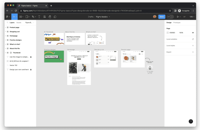
Next, organize your workspace. Create different frames for desktop and mobile views. This will help you maintain consistency across devices. Also, set up a basic style guide. Choose your brand’s primary colors, fonts, and button styles. Saving these as components early on will save you tons of time later.
Tip: Use Figma’s “Assets” panel to store your reusable elements.
Beginner’s Guide: How to Use Figma
Step 1: Planning the Front Page Layout
Before you start dragging shapes and text around, pause and plan the product roadmap. A good layout helps users navigate easily and understand your message quickly. Think about these key sections:
- Hero Section: The first thing people see.
- About Section: A short description of who you are.
- Features/Services: What you offer.
- Call-to-Action (CTA): What action you want visitors to take.
Start with wireframing. Sketch simple block layouts to plan where text, images, and buttons will go. You don’t need to be fancy here, rough wireframes work fine. Also, remember the visual hierarchy. Important elements should be bigger and more visible to keep the user journey smooth and natural.
Read: How to Create Gutenberg Blocks Based on Figma Designs
Step 2: Designing the Hero Section
Your hero section is critical. It’s where users decide to stay or leave. Here’s how to make it stand out:
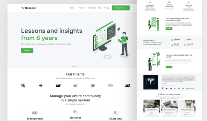
- Strong Headline: Clear, bold, and direct. Tell people exactly what you offer.
- Supporting Text: Explain briefly why it matters.
- Visuals: Use a striking image, illustration, or even an animation.
- CTA Button: “Get Started,” “Learn More,” or any action you want users to take.
Keep everything above the fold (the part visible without scrolling). Make sure users can understand your offer immediately. Here, it is best to use Figma’s grid system to align your elements perfectly.
Also read: Top Benefits of Using Figma for WordPress Web Design
Step 3: Building the Content Sections
Once your hero section is polished, it’s time to design the body of your front page. This part gives visitors the full picture of what you offer and why they should care.
About Section: Start with a short and powerful introduction about your brand or project. Focus less on lengthy histories and more on the value you provide. Make the content more personal, relatable, and customer-focused.
Features/Services Section: Break down your key features or services into digestible pieces. Use cards or neatly organized columns. Each card should include:
- A small, clear icon or relevant image
- A short, catchy heading
- A brief, one- or two-line description
This keeps the information easy to scan and understand.
Testimonials or Social Proof: Don’t forget to add real testimonials or recognizable client logos. Social proof builds trust quickly. Even a few positive reviews can make a huge impact on a visitor’s decision.
Use background color changes, subtle dividers, or section transitions to maintain a smooth, seamless flow between each part.
Know more: Best UI/UX Design Trends
Step 4: Adding Interactive Elements
While static designs look good, adding small interactive touches can make your front page feel much more dynamic and engaging. These little details grab attention and make users want to explore more.
- Button Hover Effects: Start simple. Add a hover effect where the button slightly changes color when users move their mouse over it. This small action gives immediate feedback and makes your design feel more responsive.
- Scroll Animations: Another easy way to add life is through scroll animations. You can make sections fade in or slide up as users scroll down the page. It creates a smooth, professional feel without overwhelming the visitor.
- Prototype Links: With Figma’s prototyping features, you can link buttons to other frames. This helps you simulate how the final website will behave, giving you a better sense of user flow.
Also, always check your design on mobile devices. Responsive layouts ensure your site looks great on all screens.
Check out: Best Page Builders for Figma to WordPress Conversion
Step 5: Final Touches for the Front Page Design
Once your main design is complete, it’s time to polish every little detail. This final step ensures your front page not only looks good but feels professional and complete.
- Alignment: Start by checking that all elements are perfectly aligned. Misaligned sections can make even the best design look messy. Use Figma’s alignment tools and smart guides to keep everything clean and organized.
- Spacing: Next, review your spacing. Make sure there’s enough breathing room around text, images, and buttons. Crowded layouts can overwhelm users, while generous white space helps guide the eye naturally through the page.
- Accessibility: Don’t overlook accessibility. Use high-contrast colors for text and backgrounds. Stick to clear, readable fonts at appropriate sizes. This way, your front page remains easy to use for everyone, including people with visual impairments.
- Asset Exporting: Finally, export your icons, logos, and images correctly. Figma allows you to select file formats and sizes for optimized performance.
Before wrapping up, preview your full design once more. Then, share the Figma link with team members, friends, or clients to gather fresh feedback during team meetings. A second set of eyes can catch small things you might miss!
Find out: Is WordPress Really Free for Website Owners Planning for Figma Design Conversion
Quick Tips to Elevate Your Front Page Design
Once you have the basics covered, a few extra touches can really make your front page stand out. Small improvements, especially for startup pitch, often lead to a big impact on the overall look and user experience.
- Use a 12-Column Grid: A 12-column grid is a classic layout structure that helps keep your design neat and balanced. It makes it easier to align text, images, and buttons in a consistent way, creating a visually pleasing flow.
- Stick to 2-3 Font Styles: Limiting your font choices keeps the design clean and cohesive. Too many fonts can create visual noise and confuse visitors. Choose one font for headings, another for body text, and an optional third for highlights.
- Keep It Simple: Minimal designs are not only modern but also easier to read and navigate. Avoid clutter and focus on highlighting the most important content.
- Use Figma Plugins for Images: Speed up your workflow with helpful Figma plugins. Tools like Unsplash for free stock photos and Icons8 for high-quality icons can save you time and keep your designs looking professional.
Following these small but powerful practices will dramatically improve the quality and feel of your front page.
Further reading: Best Websites for Finding Figma to WordPress Freelancers
Conclusion
Designing a project front page with Figma is not just about looking good. It’s about making your visitors feel confident, informed, and excited to take the next step. With proper planning, a clear structure, and thoughtful design, you can create a front page that leaves a strong, lasting impression.
Just remember, practice is key. The more front pages you design, the better you’ll get. So, fire up Figma, let your creativity flow, and start designing a front page that truly represents your project!
FAQs About Front Page Design
Is Figma free to use for designing a front page?
Yes, it is free. Figma offers a free plan that includes design and prototyping tools. It’s perfect for individual designers and small teams.
How do I make my Figma front page design mobile responsive?
To make the front page design in Figma mobile responsive, create separate frames for mobile and desktop views. Use constraints and auto-layout features to make sure elements adjust properly on smaller screens.
Can I use Figma templates for front page designs?
Yes, you can use Figma templates for front page designs. Many free and premium Figma templates are available online, so you can customize them to fit your brand and project.
How important is the hero section on the front page?
The hero section on the front page is extremely important! It’s the first thing users see. A well-designed hero section can instantly grab attention and encourage users to explore more.