Get this: you’ve just finished a sleek Figma design for a client’s WordPress site. It looks great, but as you hand it off to a WordPress development team, you wonder, “Is this truly accessible for all users?” This common scenario highlights the gap between visual design and functional design accessibility.
This article will shed light on key accessibility principles that bridge this gap. We’ll explore how color contrast, keyboard navigation, and form design impact real users.
By understanding these concepts, you’ll be better equipped to create designs that not only look good but work well for everyone. Whether you’re a designer or developer, these insights will help you build more inclusive WordPress sites from your Figma mockups.
Table of Contents
ToggleKey Accessibility Principles for Designers
Design accessibility isn’t just about compliance; it’s about creating products that everyone can use. By understanding a few key principles, designers can make their work more inclusive without sacrificing creativity.

- Color Isn’t the Only Way to Convey Information: Don’t rely solely on color to indicate status or importance. Use icons, patterns, or text to ensure all users can understand your design, regardless of their color perception.
- Contrast Matters More Than You Think: Ensure text is readable by maintaining sufficient contrast with its background. This helps users with low vision or those viewing screens in bright environments.
- Keyboard Navigation is Essential: Remember that not everyone uses a mouse. Design clear focus states for interactive elements so keyboard users can navigate your site easily.
- Forms Need Clear Structure: Keep forms simple and clearly structured. Use visible labels and boundaries to help all users understand and interact with form fields easily.
Steps to Ensure Figma Designs Translate Well to WordPress
Follow the steps below to ensure your designs are translated seamlessly from Figma to WordPress, keeping every pixel and interaction intact:
Step 1: Establish a Clear Design Hierarchy in Figma
Start by setting up a strong design hierarchy in Figma to ensure a seamless transition to WordPress. A clear structure not only improves visual clarity but also simplifies the conversion process. Focus on the following key areas:
- Headings and Subheadings: Organize text elements by importance, using H1, H2, H3, etc., which can directly map to WordPress’s heading tags.
- Consistent Spacing: Maintain uniform spacing and padding across sections for a cleaner, more professional look.
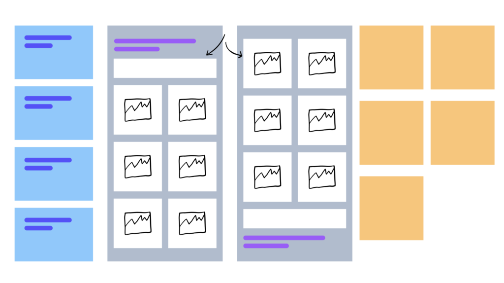
- Layer Grouping: Use logical grouping of layers and components to mirror the structure you’ll create in WordPress.
- Visual Focus: Ensure that key elements (like call-to-action buttons or important images) are visually distinct and well-positioned for easy conversion to WordPress.
Step 2: Use WordPress-friendly Fonts and Web-safe Color Schemes
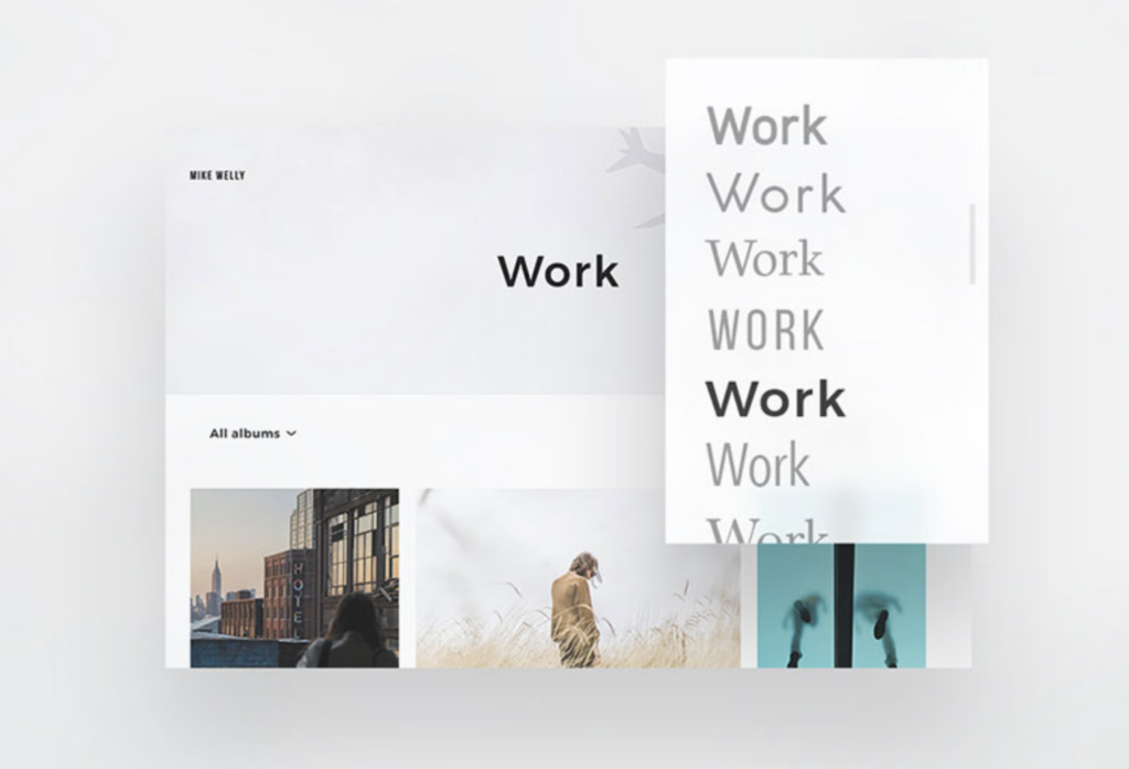
To ensure that your design maintains its visual integrity in WordPress, choose fonts and color schemes that are compatible with the web. This helps avoid display issues and ensures a consistent look across devices and browsers.

Keep these points in mind:
- WordPress-supported Fonts: Stick to Google Fonts or widely supported web fonts that can be easily integrated into WordPress.
- Web-safe Colors: Use a color palette with web-safe colors to avoid discrepancies in color rendering across different screens.
- Font Size and Readability: Make sure the font sizes are appropriate for different devices and are easy to read, especially on mobile.
- Contrast and Accessibility: Choose colors with sufficient contrast to ensure your design is accessible to all users, including those with visual impairments.
Keep Reading: Best Tips for Ensuring High Conversion Rates When Converting Figma Designs to WordPress
Step 3: Ensure Consistent Spacing, Padding, and Margins Across All Elements
Consistency in spacing, padding, and margins is key to maintaining a clean, professional design when moving from Figma to WordPress. Without uniformity, the layout can appear disjointed and affect user experience. Focus on the following:
- Uniform Padding and Margins: Maintain consistent padding and margins around elements to ensure that spacing remains balanced in WordPress.
- Grid Systems: Utilize Figma’s grid system to align content, which will make it easier to replicate a well-structured layout in WordPress.
- Responsive Spacing: Plan for different devices by ensuring that spacing adjusts smoothly between desktop, tablet, and mobile views.
- Alignment Consistency: Keep similar elements aligned consistently to avoid a cluttered look when translating the design to WordPress.
Step 4: Export Images and Assets in Proper Resolutions and Formats for Web Use
For a flawless transition from Figma to WordPress, exporting your images and assets correctly is essential. Improper resolution or format can lead to slow load times or poor visual quality.

Follow these guidelines to get it right:
- Optimized Resolutions: Export images at resolutions suitable for web use, ensuring they’re high-quality but not oversized to avoid slowing down your site.
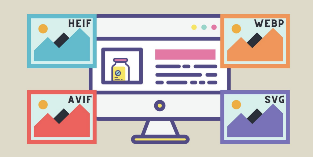
- Web-friendly Formats: Use JPEG or PNG for images, and SVG for logos and icons to maintain sharpness and scalability.
- 2x for Retina Displays: For high-definition (Retina) displays, export images at 2x the size to ensure clarity on modern devices.
- Compression: Compress images without losing quality to improve load times, using tools like TinyPNG or Squoosh.
Read More: How to Ensure Design Consistency Across Multiple Pages During Figma to WordPress Conversion
Step 5: Utilize Figma Plugins to Generate CSS Code for Exact Styling
To streamline the process of translating your Figma designs to WordPress, leverage Figma plugins that generate CSS code. This ensures that your design’s styling, including colors, fonts, and spacing, matches perfectly in WordPress. Here’s how to use this step effectively:
- CSS Export Plugins: Use plugins like ‘Figma to CSS’ or ‘CSS Generator’ to quickly extract accurate CSS for text, buttons, and layouts.
- Inspect Mode: Take advantage of Figma’s Inspect Mode to get precise CSS properties for each element, ensuring pixel-perfect replication.
- Consistent Styles: Ensure that your CSS values for padding, margins, and typography align with your Figma design.
- Custom Classes: Organize generated CSS into custom classes to maintain clean and manageable code when implementing in WordPress.
Step 6: Organize Layers and Components for Easy Translation into WordPress Structure
A well-organized Figma file can significantly speed up the conversion process to WordPress. By grouping and naming layers thoughtfully, you make it easier to translate your design into WordPress’s structure.

Keep these best practices in mind:
- Logical Layer Naming: Name layers clearly based on their function (e.g., ‘Header’, ‘Footer’, ‘CTA Button’) to make identifying elements easier during WordPress development.
- Component Grouping: Group similar elements and components, such as buttons and forms, to maintain consistency and facilitate easier coding in WordPress.
- Reusability: Define reusable components in Figma that can be easily recreated as WordPress blocks or widgets, saving development time.
- Folder Structure: Organize layers into folders based on sections of the site (e.g., ‘Hero Section’, ‘Blog Posts’) to reflect the WordPress theme structure.
Read a Comparison: Impact of Color Theory in Figma to WordPress Conversions
Step 7: Implement Responsive Design in Figma to Align with WordPress’s Mobile Responsiveness
Creating a responsive design in Figma is essential for ensuring your WordPress site works seamlessly across all devices. By planning for multiple screen sizes, you’ll save time and ensure a smooth mobile experience. Here’s how to set it up:
- Create Multiple Artboards: Design for different screen sizes (desktop, tablet, mobile) in Figma to match WordPress’s responsive behavior.
- Use Auto Layout: Take advantage of Figma’s Auto Layout feature to automatically adjust elements as the screen size changes.
- Fluid Grids: Implement a fluid grid system that can adapt to varying screen widths when translated to WordPress.
- Test Responsiveness: Preview your design in Figma’s responsive mode to check how elements will resize and reflow on smaller screens before converting to WordPress.
Step 8: Work with a Figma-to-WordPress Converter or Manual Coding for Pixel-perfect Accuracy
Achieving pixel-perfect accuracy when converting Figma designs to WordPress is crucial for maintaining the design’s integrity. You can either use automated tools or manual coding to ensure precision.

Here’s how to approach this step:
- Figma-to-WordPress Converters: Utilize tools like Anima or Figma2WP to automatically convert Figma designs into WordPress code, saving time while ensuring accuracy.
- Manual Coding: If you prefer full control, manually code the design into WordPress using HTML, CSS, and custom themes to guarantee that every element matches the Figma layout.
- Attention to Detail: Check that all spacing, fonts, and components look exactly like your Figma design once implemented in WordPress.
- Test Across Browsers: Ensure pixel-perfect accuracy by testing the design across different browsers and devices for consistent rendering.
Follow This Guide: How to Convert Figma to WordPress with Custom Animations & Microinteractions
Step 9: Test Interactivity and Animations in Both Figma and WordPress to Ensure Consistency
Testing interactivity and animations is essential for ensuring that your design behaves as expected when moved from Figma to WordPress. Here’s how to make sure the transitions are smooth:
- Prototype in Figma: Use Figma’s prototyping tools to test interactions like hover effects, buttons, and animations to ensure they work as intended.
- Match WordPress Animations: Implement matching animations and interactions in WordPress using custom CSS or plugins to recreate the Figma experience.
- Consistent Timing: Ensure that animation timings and transitions in WordPress are consistent with the ones designed in Figma for a cohesive user experience.
- Cross-device Testing: Test interactions on different devices and browsers to make sure they work fluidly across the board after implementation.
Step 10: Review Design on Different Browsers and Devices after Migration to WordPress
After migrating your Figma design to WordPress, it’s critical to test the site across various platforms to ensure consistency and performance.

Here’s how to cover all bases:
- Cross-browser Testing: Check your site on popular browsers like Chrome, Firefox, Safari, and Edge to ensure design elements display uniformly.
- Device Compatibility: Test on different devices, including desktops, tablets, and smartphones, to confirm the responsive design functions correctly.
- Screen Resolution Check: Ensure the design adapts smoothly to different screen resolutions, from low-end devices to high-definition displays.
- Fix Any Inconsistencies: Address any design misalignments or performance issues you encounter during testing to deliver a seamless user experience.
Check This Comparison: Figma vs Adobe XD
Conclusion
Design accessibility isn’t just a nice-to-have; it’s a must. By keeping these principles in mind, you’ll create WordPress sites that work for everyone, not just those with perfect vision and motor skills.
Remember, good design is inclusive design. It might take a bit more thought and effort upfront, but the payoff is huge: a website that’s usable by all your visitors, regardless of their abilities.
Plus, many of these accessibility tweaks often end up improving the overall user experience for everyone. So next time you’re working on a Figma design for WordPress, take a moment to consider how you can make it more accessible. Your users will thank you, even if they don’t realize why your site is so easy to use.
FAQs About Design Accessibility
What are the key design accessibility principles to follow in Figma when planning for a WordPress conversion?
When designing in Figma, it’s essential to adhere to principles such as color contrast, text readability, keyboard navigability, and the use of semantic elements. These principles ensure that the design remains accessible once converted to a WordPress site.
How do I maintain text readability from Figma to WordPress?
Ensure that you use web-safe fonts and check for responsiveness across different screen sizes. Also, maintain appropriate font sizes and spacing to ensure the text remains legible on all devices when converted to WordPress.
What tools can assist in checking accessibility compliance during the design process in Figma?
In Figma, you can use plugins like Contrast Checker, Able, or Stark, which help evaluate the color contrast and overall accessibility compliance of your designs, ensuring they meet standards like WCAG before conversion to WordPress.
What steps should I take to ensure keyboard navigability in my Figma design for WordPress?
Design with a logical tab order in mind, avoid complex interactions that require a mouse, and use clear focus indicators for interactive elements. This ensures ease of navigation by keyboard users in the final WordPress site.
How does semantic HTML in a WordPress theme influence accessibility, and how can Figma designs support this?
Semantic HTML enhances accessibility by providing context to assistive technologies, thereby improving their functionality. In Figma, ensure that your design clearly indicates header, section, and navigation elements, which can be mapped to semantic HTML tags during the WordPress development phase.


