Responsive design is the process of creating a website that adjusts its layout and elements according to the device’s screen size. Figma offers a range of features to help designers build responsive layouts. By using techniques like auto layout, constraints, and grids, Figma simplifies responsive design, making it an essential tool for designers working in the modern web development environment.
In this article, we will explore key strategies and techniques for achieving responsive design in Figma. From setting up responsive grids to working with constraints, we’ll cover how to make the most of Figma’s features for flexible, adaptive designs.
Table of Contents
ToggleWhy Responsive Design Matters?
Responsive design ensures that websites function well on all devices—whether it’s a desktop, tablet, or smartphone. With users increasingly accessing websites on their phones, responsive design is critical for improving user experience, increasing engagement, and boosting conversion rates.
Convert Your Figma Designs into a Responsive WordPress Site
Whether you’re looking for a smooth user experience across all devices or seamless integration, we’re here to help.
- Get Started Today
Techniques & Strategies for Responsive Design in Figma
Here are some of the techniques for implementing responsive design in Figma:
Using Auto Layout for Flexibility
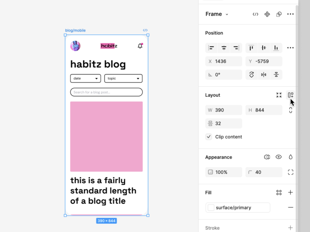
Auto Layout in Figma is one of the most powerful features for responsive design. It allows designers to create components that adjust automatically based on content size and screen dimensions.

Auto Layout can be applied to buttons, cards, forms, or any other UI elements. With it, you can make sure that the spacing between elements adjusts naturally when the content changes or when the screen size shifts.
How to Apply Auto Layout
- Select the frame or object.
- Go to the right-hand panel and click on “Auto Layout.”
- Set padding, direction (horizontal or vertical), and alignment options.
By using Auto Layout, you ensure that your design remains flexible and visually balanced, regardless of the screen size.
Read: Design Accessibility to Ensure Figma Designs Translate Well to WordPress
Setting Up Grids for Structured Layouts
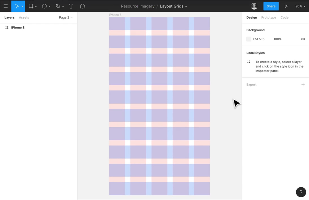
Grids are essential for creating consistent and well-organized designs. Figma allows you to set up grids for both desktop and mobile views, helping you plan how elements will resize and reposition on different screens. You can create grid systems that adapt to various screen sizes, ensuring that your layout remains intact as the viewport changes.

Setting Up Grids in Figma
- Select a frame (desktop or mobile).
- Open the layout grid panel on the right side.
- Choose a grid type (columns, rows, or grid).
- Customize the number of columns, margins, and gutters.
By adjusting your grid settings, you can ensure that your design elements flow naturally across different devices.
Learn: Common Pitfalls to Avoid for a Smooth Figma to WordPress Conversion
Using Constraints to Control Element Behavior
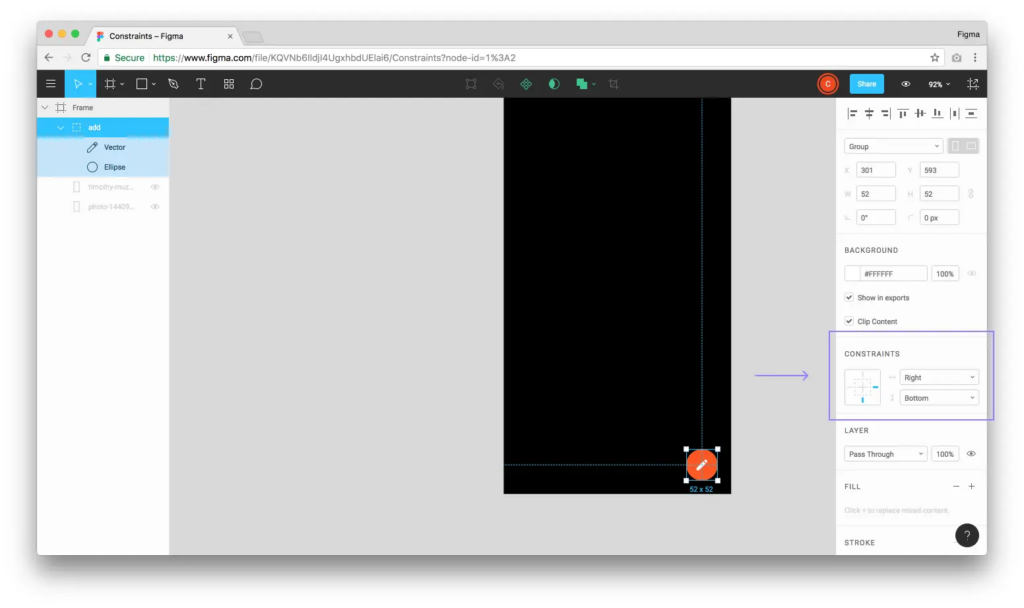
Constraints in Figma allow you to control how design elements behave when the screen size changes. You can pin elements to the left, right, top, or bottom, ensuring that they stay in place or adjust as needed. This feature is especially useful when you want specific elements, such as navigation bars or buttons, to remain fixed or adjust to certain breakpoints.

How to Use Constraints
- Select an element within a frame.
- In the right-hand panel, go to “Constraints.”
- Choose the constraints (left, right, top, bottom) based on how you want the element to behave on different screens.
Constraints give you control over the positioning and scaling of elements, making your designs more adaptable.
Know more: Best White-Label Figma to WordPress Conversion for Agencies
Adapting Typography for Different Screen Sizes
Typography plays a key role in responsive design. On smaller screens, text should remain legible, but also compact enough to fit well within the layout. Figma allows you to set up different typography styles for various breakpoints, ensuring your text adapts appropriately across devices.
Tips for Responsive Typography
- Use larger font sizes for desktop views and smaller, more compact fonts for mobile views.
- Set line heights to maintain readability across different screens.
- Create reusable text styles that can be easily applied to different devices.
By adjusting your typography, you can enhance readability and maintain a clean design on all screens.
Check out: How to Convert Figma to WordPress with Custom Animations & Microinteractions
Component Variants for Multiple Layouts
Component variants in Figma allow you to create different versions of the same component, such as buttons, cards, or forms. This feature is perfect for responsive design, as it enables you to switch between different layouts and sizes based on the screen size.
How to Use Component Variants
- Create a master component (e.g., a button).
- Add variants for different screen sizes (desktop, tablet, mobile).
- Switch between variants as needed when designing for different breakpoints.
Component variants streamline the design process by allowing you to quickly reuse and modify elements for responsive design.
Read about: Best Websites for Finding Figma to WordPress Freelancers
Utilizing Breakpoints for Responsive Layouts
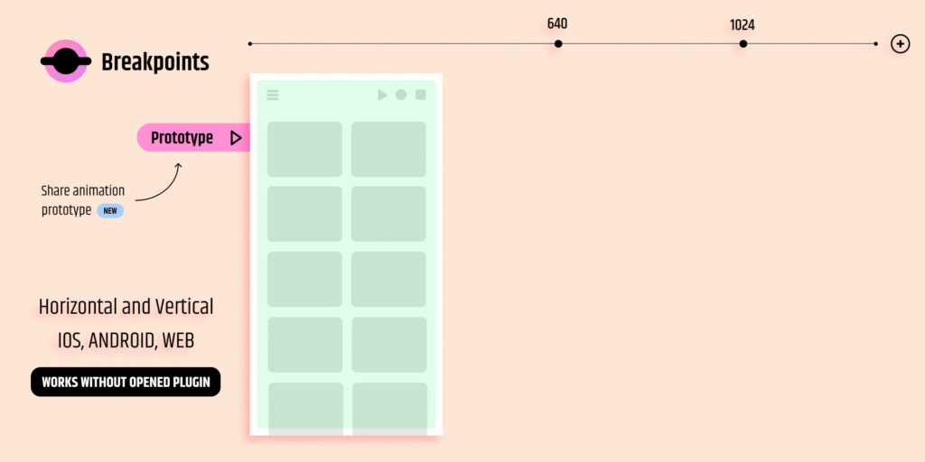
Breakpoints are specific screen widths where the design layout needs to change to accommodate different devices. In Figma, you can create multiple frames representing various screen sizes (e.g., desktop, tablet, mobile) and design accordingly for each one.

How to Work with Breakpoints
- Create frames for different screen sizes (e.g., 1440px, 1024px, 768px, 375px).
- Design each frame independently, ensuring that elements are appropriately scaled and positioned.
- Use grids and constraints to adjust elements at different breakpoints.
Designing for breakpoints ensures that your layout remains flexible and optimized for any screen size.
Check out: Best Figma to WordPress Conversion Tools
Best Practices for Responsive Design in Figma
Primarily, regularly check how your design looks on different devices by resizing your frames or previewing the design in Figma’s prototype mode. Next,
- Keep Components Consistent: Ensure that your components remain consistent across different screen sizes by using reusable elements.
- Start with Mobile-First Design: Designing for mobile first can help you focus on the essentials and then scale up for larger screens.
- Use Spacing Wisely: Ensure that there is enough padding and spacing between elements, especially on smaller screens.
Conclusion
Responsive design is a must-have for any modern website, ensuring that your content looks great on all devices. Figma’s powerful tools, such as Auto Layout, grids, and constraints, make it easy to create responsive designs that adapt seamlessly to various screen sizes. By mastering these techniques, designers can ensure their layouts remain visually appealing and functional across all devices.
As user expectations evolve, creating responsive designs with Figma becomes even more critical. Whether you’re working on a complex web project or a simple mobile app, Figma’s features can help you achieve a flexible, adaptive design that enhances user experience.
FAQs About Figma Responsive Design
What is responsive design in Figma?
Responsive design in Figma refers to creating layouts that adapt to different screen sizes and orientations, ensuring that the website or app looks great on all devices.
How can Auto Layout help with responsive design?
Auto Layout allows components to adjust automatically based on the content and screen size, ensuring flexibility and consistency in your design.
Why should I use grids in Figma?
Grids help you create structured layouts, ensuring that elements are aligned and spaced consistently across different devices.
What are constraints in Figma, and how do they work?
Constraints allow you to control how design elements behave when the screen size changes, ensuring that certain elements stay in place or adjust accordingly.
How can I test my responsive design in Figma?
You can test your design by resizing frames, using Figma’s prototype mode, or previewing how it looks on different devices by changing screen dimensions.


