Imagine you’re a web designer racing against the clock to meet a tight deadline for building up a WordPress website. You’re staring at a blank canvas and need to quickly decide between Figma, your go-to design tool, and Tilda, a newer option that promises sleek, no-code website building. Figma gives you total control over every pixel, but requires coding and development to bring those designs to life. On the other hand, Tilda boasts 550+ pre-designed blocks, allowing you to create beautiful, responsive websites straight from the platform—no code needed. Comparing Figma vs Tilda, it’s a tempting solution for when you need to save time without sacrificing design quality.
In moments like these, the pressure is on to pick the right tool. Should you stick with the tried-and-true Figma, which offers endless flexibility but requires a more complex workflow? Or opt for Tilda, which might help you meet that deadline faster with its intuitive, pre-built elements? This article will dive into the key differences between Figma and Tilda, so you can make an informed choice about which one suits your design needs and timeline best.
Table of Contents
ToggleA Brief Overview of Figma and Tilda
Figma is a comprehensive design tool used to create fully customized designs that require coding to bring to life. Tilda, on the other hand, is a no-code platform designed to help users quickly build functional websites using pre-designed blocks. Here’s a quick breakdown of each tool’s strengths.
Figma
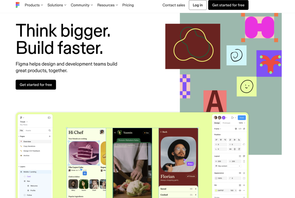
Figma is a powerful, collaborative design platform that allows for highly customizable, pixel-perfect designs. While it requires more technical knowledge and developer handoff, it is ideal for those looking to craft unique, intricate layouts.
Key Highlights:
- Complete design freedom
- Advanced collaboration tools
- Requires coding for development
- Perfect for large-scale design projects
A Useful Resource: Design Accessibility: How to Ensure Figma Designs Translate Well to WordPress
Need Figma Designs that Translates Neatly to Your WordPress Site?
We know just how! Our cutting edge Figma design specialists deliver custom web layouts in spotless transfers for uniquely branded websites. All for a cost that suits your budget!
Tilda
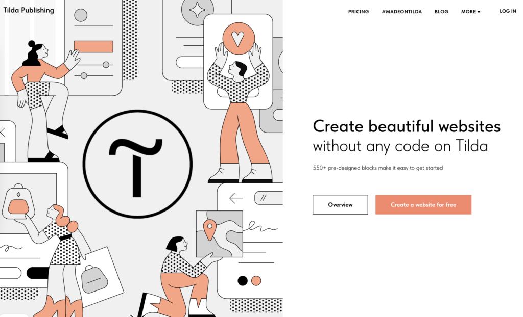
Tilda focuses on ease of use, allowing designers and non-designers alike to create beautiful, functional websites without writing a single line of code. With its pre-designed blocks, Tilda helps speed up the process, making it an excellent tool for smaller projects or those with time constraints.
Key Highlights:
- No coding required
- 550+ pre-designed blocks
- Fast website creation
- SEO-friendly features built-in
Did You Know?
How to Maximize SEO Performance in Figma to WordPress Conversions
10 Web Design Criteria to Measure the Merits of Figma vs Tilda
When deciding between Figma and Tilda for building a website from scratch, it’s important to compare both platforms based on key web design criteria. Figma is a powerful tool for designing anything you can imagine, while Tilda offers a more streamlined, no-code solution with pre-designed blocks.
Let’s break down their differences in five crucial areas to help you make the best choice for your project.
Figma vs Tilda: Design Flexibility
Design flexibility plays a major role in determining the right tool for your project. Figma offers designers the freedom to build highly customized and intricate designs from scratch, with limitless possibilities for layout, interaction, and animation.
- Figma: Provides granular control over every design element, perfect for bespoke, pixel-perfect creations. Ideal for projects requiring a high level of customization.
- Tilda: Limits flexibility by offering pre-designed blocks, but simplifies the process significantly. Great for projects that prioritize clean, effective design with less customization.
Did You Know?
How to Seamlessly Turn Figma Designs into WPBakery Layouts
Figma vs Tilda: Ease of Use
When it comes to usability, Figma and Tilda serve different audiences based on their respective design processes. Figma is a robust tool, but it comes with a learning curve that favors more experienced designers.
- Figma: Advanced and feature-rich, but may overwhelm beginners. Designers need to be proficient in design principles and workflows to maximize Figma’s potential.
- Tilda: Exceptionally easy to use, offering a drag-and-drop system with pre-made blocks. It’s perfect for users with little design experience who want to build websites quickly without coding.
Figma vs Tilda: Coding Requirements
A big differentiator between Figma and Tilda is coding. Figma is primarily a design tool, and you’ll need to involve developers to turn those designs into functional websites.
- Figma: Requires coding or developer involvement to bring designs to life, adding more complexity and cost to the workflow.
- Tilda: No coding necessary. Tilda’s intuitive interface lets you create a full-fledged website without writing a single line of code, perfect for designers with no technical background.
Find Out More: Common Pitfalls to Avoid for a Smooth Figma to WordPress Conversion
Search Engine Optimization (SEO) in Figma and Tilda
Search engine optimization plays a crucial role in ensuring your website is discoverable. While Figma doesn’t handle this side of things, Tilda offers built-in SEO-friendly features.
- Figma: Does not include built-in SEO features; you’ll need to optimize your site’s SEO separately during the development process.
- Tilda: Optimizes previews for social sharing and search results automatically, ensuring your project looks its best in search engines without additional effort.
Font Customization and Integration in the Two Design Apps
Both platforms offer robust font options, but Tilda makes font customization a breeze, especially for those who aren’t familiar with custom code.
- Figma: Offers full flexibility with font customization but requires manual handling, either by integrating Google Fonts or embedding custom fonts during development.
- Tilda: Integrates seamlessly with Adobe Fonts, Google Fonts, and even allows you to upload your own custom fonts, simplifying the process of creating a distinctive, on-brand design.
Discover More: How to Optimize Your Figma to WordPress Workflow for Faster Website Launches
Figma vs Tilda: Performance
Website performance is crucial for user experience and SEO. While Figma focuses on design, the final performance of a Figma-built website depends on how well it’s developed afterward.
- Figma: Performance largely depends on the developer and hosting setup, with no built-in features to optimize website speed.
- Tilda: Automatically delivers images and content through a global CDN, reducing page load time and ensuring your website runs quickly regardless of where visitors are located. Perfect for those who need a quick-loading website without worrying about the technicalities.
Read This Comparison: Figma vs Marvel: A Comparison of Prototyping Powerhouses
Development Workflow for Figma and Tilda
The process of bringing your designs to life can either be simplified or made more complex, depending on which platform you choose. Figma relies on a designer-to-developer handoff for development, while Tilda allows for a more integrated workflow.
- Figma: Requires exporting designs and passing them on to a developer for coding, adding extra steps to the workflow.
- Tilda: No handoff needed—design, build, and publish a functional website all within the same platform, speeding up the workflow for tight deadlines.
Discover More: Figma to Gutenburg Using Spectra Block Editor
Figma vs Tilda: Design Collaboration
Collaboration is vital, especially for teams working remotely or across different departments. Both Figma and Tilda offer collaboration features, but to different extents.

- Figma: Highly collaborative, allowing multiple team members to work on a design simultaneously. Perfect for design teams and real-time feedback loops.
- Tilda: Limited in collaboration features but allows easy sharing of designs for review and feedback. Best for solo designers or smaller teams.
Did You Know?
Photoshop to Figma: Methods to Integrate Into Your Web Design Workflow
Figma vs Tilda: Design Speed
In terms of speed, Figma and Tilda cater to different priorities. Figma’s process is more thorough but takes longer, while Tilda is built for rapid website development.
- Figma: Slower due to its focus on detailed, custom design elements. Great for high-end projects that need time and attention to detail.
- Tilda: Extremely fast, with pre-designed blocks and templates that reduce design time significantly. Ideal for projects with tight deadlines or simpler design needs.
Another Comparative Guide for Prospective Figma Users: Figma vs Sketch: Which Design Tool is Right for You?
Figma vs Tilda: Pricing Comparison
When it comes to pricing, Figma and Tilda offer different structures based on the needs of designers and teams. Figma’s pricing is tailored for individuals, small teams, and enterprises with a focus on collaboration, while Tilda’s pricing is more geared toward solo designers or small businesses looking for an all-in-one website-building solution. Below is a detailed breakdown of the pricing plans for both platforms.
| Plan | Tilda | Figma |
| Free Plan | 1 website, basic blocks | Figma editor, 3 collaborative files, unlimited drafts |
| Free | Free | |
| Personal/Starter | 1 website, full access to blocks, custom domain | Unlimited files, team libraries, advanced prototyping |
| $10/month (billed annually) | $15/month per seat (billed annually) | |
| Business/Professional | 5 websites, code export, all Personal features | Everything in Starter, with advanced team collaboration features |
| $20/month (billed annually) | $45/month per seat (billed annually) | |
| Enterprise | Not offered | Centralized admin, SSO, design system analytics, branching and merging |
| N/A | $75/month per seat (billed annually) |
Key Takeaways on Pricing
- Tilda: Offers a simpler pricing model, with free, personal, and business plans designed for individuals or small businesses who need a straightforward solution without needing extensive collaboration features. Its Personal Plan is quite affordable, especially if you’re building only one site.
- Figma: Has a more complex pricing structure based on team size and collaboration needs. While the free version is suitable for freelancers or small projects, teams working on large-scale designs will likely need to upgrade to Professional or Enterprise plans, which can get costly, particularly if you need multiple seats.
If you’re a solo designer or small business owner focused on website creation, Tilda’s lower-tier plans may suit you better. For larger teams or enterprises needing collaborative design features, Figma offers more robust options.
Learn More: Figma vs Affinity Designer: Which Tool to Choose?
The Upshot: Figma Wins Again?
While Tilda offers a fantastic no-code solution for quick, beautiful websites, Figma’s robust design flexibility, collaboration features, and seamless team workflow make it the better choice for those who prioritize complete creative control and professional design processes. Figma allows designers to push boundaries, create intricate designs, and collaborate with developers and other team members in real-time, making it ideal for larger projects or teams that require extensive collaboration.
If you’re looking for a more streamlined approach with pre-built elements, Tilda shines in the simplicity and speed it provides, but for those who need advanced design capabilities and are willing to work through a more complex workflow, Figma stands out as the go-to tool. Ultimately, Figma’s versatility and collaborative power make it the top contender for designers aiming for more ambitious and custom projects.

