
When it comes to building a website, creating a fully responsive website is of utmost importance. With users browsing from smartphones, tablets, laptops, and desktops, your website must adapt to all screen sizes and mobile devices. If you’ve designed your website in Figma and want to convert it into a responsive WordPress site, this guide is for you. So, let’s walk through how to make your Figma to WordPress site fully responsive.
What is Responsive Design?
Responsive design is a web development approach that ensures a website looks and functions well across all devices. It adapts layout, content, and navigation to different screen sizes without compromising user experience.
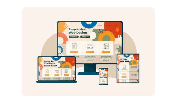
In simple terms, a responsive WordPress website automatically adjusts to desktops, tablets, and mobile phones. This flexibility improves accessibility and makes browsing more enjoyable for your visitors. A responsive site also supports better SEO rankings, as Google prefers mobile-friendly websites.
Why Responsive Design Matters for WordPress?
Whether you’re running a blog, business website, or eCommerce store, responsiveness affects several performance areas:
- User engagement: Visitors stay longer on a site that’s easy to navigate on any device.
- Bounce rate: A non-responsive site frustrates users, increasing your bounce rate.
- Conversions: Mobile users convert better on responsive websites.
- SEO performance: Google’s mobile-first indexing rewards responsive sites.
If your WordPress site isn’t responsive, you’re losing potential users and ranking opportunities.
Build a Responsive Website from Your Figma Design
Turn your Figma mockups into a fully responsive, high-performance WordPress website without compromising on design or functionality.
Designing with Figma for WordPress Conversions
Figma is a powerful, browser-based design tool that makes collaborating with teams in real time easy. It’s a favorite among UI/UX designers because of its intuitive interface and flexible features. Some of the benefits of using Figma for web design include:
- Real-time collaboration: Share designs instantly and gather feedback live.
- Auto-layout: Adjusts elements dynamically, simplifying responsive design.
- Component reuse: Maintain consistency by reusing elements across pages.
- Design systems: Create and follow a visual language for cohesive branding.
Designing with Figma allows you to build a structured layout that can easily be translated into responsive WordPress themes.
Check out: Best Prototyping Tools for UI/UX Designers
Converting Figma to WordPress
After designing in Figma, the next step is to convert those designs into a working WordPress site. Here are some common conversion methods:
- Manual coding: Developers hand-code HTML, CSS, and JavaScript based on Figma designs.
- WordPress page builders: Tools like Elementor or Beaver Builder help recreate the design visually. They allow you to import Figma design assets and arrange them visually. This is useful for non-developers who want control over layout and responsiveness.
- Partnering with Agencies: Agencies like figtowp can quickly and precisely convert Figma designs into responsive WordPress code.
What to Consider During the WP Conversion Process
The goal is to maintain visual integrity while ensuring responsive behavior. So, ensure to:
- Match Design with Functionality: Buttons, forms, and media should be as designed in Figma
- Use Semantic HTML: This helps in SEO and web accessibility.
- Adopt Mobile-first Approach: Start your CSS styling from mobile and scale upward.
Working with WordPress Templates
WordPress uses a templating system that defines how content is displayed. Understanding how templates work is crucial when building a responsive site from Figma designs. Key template files include:
- header.php: Contains the site’s header and navigation.
- footer.php: Defines the footer section.
- index.php: The main template file.
- style.css: Holds all your styling rules.
- single.php and page.php: Used for posts and pages respectively.
Using these files, developers can structure content properly and ensure the theme is responsive.
Read: Elementor vs Wix
Understanding Design Elements and Their Role in Conversion
Each visual element in Figma has a functional role in WordPress. Knowing how to interpret and apply these is crucial for a smooth transition. Key design elements include:
- Navigation bars: Convert into WordPress menus.
- Forms: Use plugins like WPForms or custom code.
- Buttons and CTAs: Use WordPress blocks or shortcodes.
- Sliders and galleries: Plugins like MetaSlider or Elementor widgets help.
During conversion, pay close attention to spacing, alignment, and interactivity to maintain a polished look.
Using HTML and CSS to Convert Figma to WordPress
Converting your design into HTML is often the first step to bringing your design to life in WordPress. Steps to convert Figma to HTML are as follows:
- Export design assets from Figma (images, icons, fonts).
- Write HTML structure based on your layout.
- Apply CSS styles to match the Figma design.
- Use media queries to make it responsive.
HTML files serve as the base for developing a custom WordPress theme. Developers then break them into WordPress template parts.
Complete guide: How to Convert Figma to HTML/CSS
Important WordPress Development Considerations
Creating a fully functional WordPress website goes far beyond replicating your Figma design pixel for pixel. It requires thoughtful planning, implementation of best practices, and a focus on long-term performance, usability, and growth. Here are the key factors to keep in mind:
Responsive Website Layout
In today’s multi-device world, a responsive layout is non-negotiable. Use flexible grids, relative units like %, vw, and rem, and CSS media queries to ensure your layout adjusts gracefully to different screen sizes. Prioritize a mobile-first approach, then scale up for tablets and desktops.
Web Accessibility Standards
Web accessibility ensures your site can be used by all visitors, including those with disabilities. Use semantic HTML elements, label form fields properly, and maintain sufficient color contrast. Make sure your site is fully navigable using a keyboard and compatible with screen readers. This not only broadens your audience but also aligns with modern compliance standards like WCAG.
Website Performance
A fast-loading website significantly improves user experience and search engine rankings. So, optimize images using modern formats like WebP, minimize CSS and JavaScript files, and enable lazy loading for off-screen content. Also, use caching plugins and a Content Delivery Network (CDN) to reduce load times globally.
SEO (Search Engine Optimization)
To boost visibility, incorporate on-page SEO best practices. Use keyword-rich meta titles and descriptions, clean and readable URLs, and proper heading structures (H1, H2, etc.). Plus, add schema markup to help search engines understand your content better, while an XML sitemap ensures proper indexing.
WordPress Website Security
Security is vital for protecting user data and maintaining trust. Use only well-reviewed and updated plugins, implement SSL certificates, and enable regular backups. Also, limit login attempts, use strong passwords, and consider adding a firewall plugin like BlogVault to guard against threats.
Each of these considerations contributes to a professional, scalable, and reliable WordPress website.
Know more: Role of Figma in Building Mobile-Responsive WordPress Websites
Choosing or Creating Responsive WordPress Themes
Selecting the right WordPress theme is a critical step in building a responsive website. A responsive theme ensures your content looks great and functions seamlessly across all devices, from desktops to smartphones.
What Makes a Theme Responsive?
A truly responsive WordPress theme includes several essential features that work together to provide a smooth, user-friendly experience:
- Media queries: These CSS rules adjust layouts based on screen size, ensuring elements reflow properly on different devices.
- Fluid images and videos: Visual content automatically scales within its container, preventing layout breakage and maintaining visual balance.
- Mobile-friendly navigation: Elements like hamburger menus or slide-in panels make navigation simple and intuitive on smaller screens.
- Font scalability: Responsive themes use relative units (like em or rem) to ensure text remains legible across various resolutions and devices.
These elements ensure that your website adapts to user behavior and device capabilities, which enhances both usability and performance.
Recommended WordPress Responsive Themes
If you’re looking for reliable, pre-built themes that prioritize responsiveness, consider the following:
- Astra: Lightweight, fast, and highly customizable. Astra works seamlessly with major page builders.
- GeneratePress: Focused on speed and performance, GeneratePress offers a minimal design ideal for custom development.
- Neve: A modern, mobile-first theme that loads quickly and supports AMP out of the box.
- Kadence: Known for its drag-and-drop header builder and flexibility, Kadence makes it easy to create responsive layouts.
These themes are well-coded, regularly updated, and designed to work across all screen sizes.
Also read: Responsive Design in Figma Best Techniques
Creating a Custom Responsive Theme
Alternatively, you may want to build a custom theme using your Figma design as a blueprint. This approach offers greater control over branding, layout, and functionality. However, it also requires a solid understanding of WordPress template hierarchy, CSS frameworks, and responsive design principles.
If you go the custom route, be sure to:
- Start with a mobile-first design approach
- Use a responsive CSS framework like Tailwind CSS or Bootstrap
- Test your theme on multiple devices and screen sizes
- Use developer tools (like Chrome DevTools) to debug responsiveness
Web Developer Tips for Making a Figma to WordPress Site Fully Responsive
Converting a Figma design into a fully responsive WordPress website requires more than just visual accuracy. It demands a strategic approach that combines design interpretation with technical execution. Below are practical developer tips to help ensure your site functions seamlessly across all devices.

Start with a Mobile-First Approach
Begin your CSS styling with mobile screen sizes and scale up using media queries. This method ensures the core design remains lightweight and user-friendly, especially for mobile users.
Use Flexible Layout Units
Instead of fixed pixel values, use relative units like %, em, rem, and vw. These units allow your layout to adapt smoothly to different screen sizes without breaking the design structure.
Break Down the Figma Design into Reusable Components
Identify reusable sections such as headers, buttons, cards, and forms. Translate these into modular WordPress template parts or blocks. This not only simplifies development but also improves site maintainability.
Optimize Assets for Performance
Export only necessary assets from Figma. Compress images, use modern formats like WebP, and serve them at appropriate resolutions to reduce load times. This enhances both responsiveness and page speed.
Use a CSS Framework or Utility-First Library
Frameworks like Bootstrap or Tailwind CSS provide responsive grid systems and utility classes out of the box. These tools help you implement consistent, responsive layouts faster.
Integrate Responsive Plugins Carefully
Choose WordPress plugins that are known to be responsive and lightweight. Whether you’re adding sliders, forms, or galleries, ensure they render well on all screen sizes without bloating your site.
Leverage Browser Developer Tools
Use tools like Chrome DevTools to inspect and test responsiveness during development. You can simulate various devices and screen sizes to catch issues early.
Test on Real Devices
While emulators are useful, real device testing gives you a more accurate picture of how your website behaves in actual usage scenarios. Check interactions like taps, scrolls, and hover states.
Avoid Absolute Positioning for Key Elements
Overusing absolute positioning can lead to layout issues on smaller screens. Instead, use flexbox or grid layouts for better adaptability and cleaner code.
Document and Maintain Consistency
Maintain a style guide or reference from your Figma design. Ensure consistent use of spacing, typography, and breakpoints across all templates and stylesheets.
Conclusion
With modern tools and techniques, creating a responsive WordPress site from Figma is easier than ever. The Figma to WordPress conversion steps may vary depending on your technical skills, but the principles remain the same: plan, build, test, and refine.
By combining Figma’s powerful design features with WordPress’s flexibility, you can build a website that not only looks great and is visually appealing but also performs well across all devices.
FAQs About Responsive WordPress Website
What does responsive design mean?
A responsive design ensures that your website looks and functions well on all devices, including desktops, tablets, and smartphones. This involves setting flexible grid layouts, images, and CSS media queries.
Why is responsiveness important for a website?
Responsive design improves user experience by ensuring content is accessible and visually appealing across all devices, which can lead to increased engagement and better search engine rankings.
How can I ensure my Figma designs are responsive?
Start by designing with a mobile-first approach. Utilize Figma’s constraints and auto-layout features to create flexible and adaptable components that translate seamlessly into code for various screen sizes.
What role does CSS play in making a website responsive?
CSS is crucial for responsive design as it controls the layout and appearance of your site. Use CSS media queries to adjust styles based on device characteristics, such as screen size.
What WordPress themes are best for responsive sites?
Many WordPress themes are designed with responsiveness in mind. Themes like Astra, GeneratePress, and OceanWP are popular choices for their flexibility and responsive capabilities.
How can plugins help with responsiveness in WordPress?
Responsive plugins can help optimize images, manage responsive menus, and ensure elements scale correctly. Plugins like WPForms and Advanced Responsive Video Embedder are useful tools.
How do I test the responsiveness of my site?
Use browser developer tools and responsive web design testing sites to check how your site performs on different devices and screen sizes.