

Today, creating user-friendly, functional, and visually appealing products is more important than ever. Product design plays a central role in shaping how users interact with digital products, whether they’re mobile apps, websites, or software platforms.
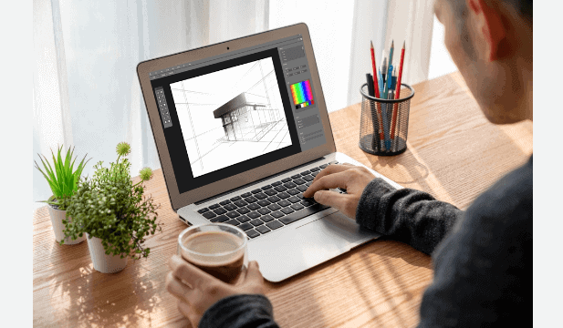
Figma is a cloud-based design tool used by product designers around the world. It combines the best of vector graphics and prototyping tools into one collaborative environment. With features like real-time collaboration, design systems, and auto layout, Figma makes the design process smoother and more efficient.
Whether you’re a beginner or a professional designer, this guide will walk you through the basics and best practices for using Figma for product design, from setting up your first file to creating full-fledged design systems.
Figma for Product Design: An Overview
Figma is more than just a design tool. It’s a collaborative workspace that allows product designers, developers, and stakeholders to work together in real-time. With Figma, you can:
- Design interfaces from scratch
- Build interactive prototypes
- Create and maintain design systems
- Collaborate with your team instantly
- Conduct handoffs with developers seamlessly
Thanks to its browser-based interface, there’s no need to download software. All your files live in the cloud, making access easy and sharing even easier.
Design Smarter. Launch Faster. Grow Better.
Whether you’re starting from scratch or improving an existing product, our team of experienced product designers can help you create intuitive, scalable, and conversion-driven designs.
Why Do Product Designers Love Figma?
Figma has become the go-to tool for product designers, and for good reason. It offers a powerful blend of usability, flexibility, and collaboration that fits seamlessly into modern design workflows.
Ease of Use: Intuitive and Beginner-Friendly
Figma’s interface is clean, organized, and easy to navigate, even for beginners. Designers can quickly learn the basics and start designing without a steep learning curve. Its drag-and-drop functionality, context-aware toolbars, and helpful hints make it approachable and efficient.
Real-Time Collaboration: Teams Can Work Together from Anywhere
One of Figma’s biggest strengths is its real-time collaboration feature. Multiple team members can work on the same file simultaneously, see changes live, and communicate via comments. This eliminates the need for endless file versions or back-and-forth emails, streamlining teamwork across different time zones.
Powerful Features: Auto Layout, Components, and Prototyping
Figma comes packed with professional-grade tools, such as auto layout for responsive design, reusable components for consistency, and interactive prototyping to bring static screens to life. These features empower designers to work smarter and iterate faster without switching tools.
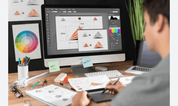
Design System Support: Create Reusable Styles and Elements
Figma makes it easy to create and manage design systems. Designers can define text styles, color palettes, and components once and reuse them across multiple projects. This not only maintains visual consistency but also improves efficiency and reduces design debt over time.
Cross-Platform: Works on Any Device with a Web Browser
As a cloud-based tool, Figma runs entirely in the browser. That means no downloads, no installations, and no compatibility issues. Whether you’re on a Mac, PC, Chromebook, or even a tablet, you can access your design files from anywhere with internet access.
Learn: How to Convert Figma Designs into a 3D Shopify Store
Understanding the Product Design Process
Product design is not just about creating visually appealing interfaces; it’s about solving real user problems through thoughtful and functional design. A successful product design process is both strategic and user-centered, ensuring that the final outcome meets both user expectations and business goals. The typical product design process includes the following key stages:
Research and Discovery
This is the foundation of any design project. Designers conduct user research, stakeholder interviews, and market analysis to understand the target audience’s needs, pain points, and behaviors. The goal is to gather insights that inform design decisions.
Figma supports this phase by allowing designers to compile research findings in one place using visual boards or shared project files that the entire team can access and comment on.
Ideation (Brainstorming Sessions) and Wireframing
Once the research is complete, designers brainstorm solutions and begin sketching out early concepts using low-fidelity wireframes. This stage helps define the structure and layout of the product without getting caught up in visual details.
With Figma, designers can quickly build and iterate wireframes using components, frames, and layout grids. Collaboration during ideation is seamless, thanks to real-time editing and commenting.
Prototyping
Prototypes bring wireframes to life by simulating how users will interact with the product. This allows teams to visualize user flows, transitions, and functionality.
Figma’s built-in interactive prototyping tools make it easy to link screens, add animations, and test interactions without exporting files to a separate tool.
Usability Testing
After creating a prototype, designers gather feedback by conducting usability tests with real users. This step uncovers friction points, confusing elements, or missed opportunities in the design.
In Figma, prototypes can be shared via simple links, making it easy to collect feedback from testers, stakeholders, and team members. Comments can be left directly on the design, keeping all feedback in one centralized space.
Final Design and Handoff
Once testing is complete and iterations are made, the final design is polished and prepared for development. This includes refining visual elements, ensuring responsiveness, and documenting specifications.
Figma’s Dev Mode allows developers to inspect designs, download assets, view CSS snippets, and adhere to design guidelines, making handoff smooth and efficient.
Key Principles of Effective Product Design
To create successful digital products, designers must follow a set of product design principles that ensure both usability and business alignment.
- User-Centered Thinking: Design always starts with the user. Understanding their goals, frustrations, and behaviors helps create solutions that truly meet their needs.
- Consistency: A consistent visual language, colors, typography, spacing, and interaction patterns help users navigate your product with ease and confidence. It also strengthens your brand identity.
- Accessibility: Inclusive design ensures that everyone, including users with disabilities, can interact with your product. This includes using readable fonts, clear contrast, and keyboard-friendly navigation.
- Feedback Loops: Design is iterative. Testing early and often allows you to catch issues before they grow and refine the product based on real user input.
- Cross-functional Collaboration: Design doesn’t happen in a vacuum. Working closely with web developers, product managers, and stakeholders helps ensure that designs are feasible, scalable, and aligned with business goals.
Now that you know the core principles, let’s explore how to bring your ideas to life using Figma.
Check out: How to Convert Figma to Gutenberg
Using Figma for Product Design: Step-by-Step
Here are the simple steps that you can follow to create a product design in Figma:
Step 1: Setting Up Your Design File
The first step in any design project is to create a new file in Figma.
- Click on the “+ New File” button on your dashboard
- Use the Frame tool (shortcut: F) to start creating your layout
- Set up different frames for screens like login, home, settings, etc.
Organizing your file is key. Use pages to separate flows (e.g., user flows, wireframes, components) and naming conventions to keep things tidy. You can also use Figma’s properties panel to set dimensions, apply grids, and align individual elements for pixel-perfect designs.
Step 2: Building Components with Auto Layout
Figma’s Auto Layout feature is a game-changer for responsive and scalable design. With auto layout, you can:
- Automatically adjust the spacing between elements
- Set padding and alignment
- Create buttons that resize with text
- Build lists that grow as items are added
To use auto layout:
- Select a group of elements
- Click “+” next to Auto Layout in the right-hand panel
- Customize spacing, padding, and direction
Auto layout reduces the need for manual resizing and ensures your designs stay consistent across breakpoints and screen sizes.
Step 3: Creating a Design System
A design system is a set of reusable components, styles, and guidelines that keep your product’s design consistent. In Figma, you can create a design system by:
- Defining text styles (headings, paragraphs, labels)
- Creating color styles (primary, secondary, error)
- Building components (buttons, form fields, cards)
- Organizing these into shared libraries
Figma allows you to publish components and styles to team libraries so everyone stays on the same page. This speeds up your workflow and reduces design debt in the long run.
Step 4: Working with Text Layers
Text plays a critical role in UI design, and Figma makes working with text easy and flexible. Here’s what you can do with text layers in Figma:
- Use the Text tool (T) to create and edit text
- Customize font, size, line height, and alignment
- Apply text styles for consistency
- Combine with the auto layout for responsive behavior
Tip: Create a typography scale early in your design system. Define styles like H1, H2, body text, captions, etc., and reuse them across your design.
Step 5: Collaborating with Your Design Team
One of Figma’s standout features is real-time collaboration. Multiple team members can work on the same file simultaneously, just like Google Docs. Here’s how to collaborate effectively in Figma:
- Invite teammates to your design file with edit or view permissions
- Use the comment tool to leave feedback or ask questions
- Tag teammates using @username to notify them
- Share prototypes with stakeholders via shareable links
- Use Version History to track changes and revert if needed
Collaboration doesn’t stop at designers. Figma’s Dev Mode allows developers to inspect designs, get specs, and download assets without redlining or PDFs.
Know more: How to Use Figma Mockups for WordPress Development
Bonus Tips for Better Figma Workflow
A smooth and efficient Figma workflow can save you time, reduce design inconsistencies, and improve team collaboration. Here are a few practical tips to help you get the most out of Figma:
- Use Plugins: Figma’s plugin library is vast and growing. Tools like Content Reel help you insert placeholder text, avatars, and icons, while Unsplash lets you add high-quality stock images directly into your designs. These plugins speed up your workflow and add realism to mockups.
- Apply Constraints: Constraints allow your elements to resize intelligently when the frame changes. This is especially helpful when designing for multiple screen sizes, ensuring your layout remains consistent and responsive.
- Utilize Grids: Grids provide a strong visual structure, helping you maintain alignment and spacing across your design. They’re essential for clean, professional layouts and scalable design systems.
- Use Prototypes: Instead of static mockups, use Figma’s prototyping tools to connect screens with interactions. This allows stakeholders and developers to experience the flow as a real user would.
- Document Everything: Add clear notes, annotations, and usage guidelines alongside components and design flows. This improves team communication, ensures consistency, and makes handoffs to developers smoother and more reliable.
What’s Best: Figma to WordPress Automation vs Professional Services
Conclusion
Figma is one of the most powerful tools available for modern product design. From its clean interface to its collaborative features, it has everything a designer needs to create, iterate, and refine user-centered digital products.
Using Figma, you can:
- Set up clean and structured design files
- Build components with auto layout
- Develop and manage full design systems
- Work effectively with text layers and typography
- Collaborate seamlessly with your team
Whether you’re working on a new startup idea, a redesign, or a scalable design system, Figma provides the flexibility and control to bring your vision to life.
By following a clear product design process and making the most of Figma’s features, you can create user experiences (UX design) that not only look great but also work flawlessly.
FAQs About Figma for Product Design
Can Figma be used for product design?
Yes, Figma is widely used for product design. It supports everything from wireframing and prototyping to creating design systems and collaborating with cross-functional teams.
Can I use Figma as a beginner?
Absolutely. Figma is beginner-friendly, with an intuitive interface, helpful tutorials, and a low learning curve, making it easy for newcomers to start designing quickly for all types of company strategy.
How to use Figma professionally?
To use Figma professionally for product strategy, focus on building consistent design systems, use components, apply auto layout, collaborate in real-time with teams, and create interactive prototypes for user testing and developer handoff.
What is Figma mostly used for?
Figma is mostly used for UI/UX design, including website and app interfaces, prototyping, wireframing, and creating collaborative design systems for digital products.