

Known for its collaborative capabilities, Figma allows teams to create, prototype, and share designs seamlessly. Among its array of features, creating reaction text is a powerful way to enhance design interaction and convey dynamic feedback to users. This detailed guide will walk you through the process of making reaction text in Figma, helping you to create more engaging user interfaces. Whether you’re a beginner or a seasoned designer, this guide will provide you with the insights needed to implement reaction text in your projects.
What is a Reaction Text in Figma?
Reaction text refers to interactive text elements that change based on user interactions. For example, when a user hovers over a button, the text might change to provide feedback or indicate the action that will be performed upon clicking. This form of dynamic text is crucial for enhancing user experience as it provides the necessary context and feedback. It also helps guide the user and make interfaces intuitive and responsive.
1. Setting Up Your Figma Project
The initial setup of your project plays a crucial role in creating reaction text in Figma. This foundational step involves organizing your workspace to ensure a smooth design and prototyping process.
Create or Open a Project
Use your credentials to log in or create a new Figma account if you haven’t already. Upon logging in, you’ll be directed to your dashboard, which lists all your projects. Click the ‘New File’ button to create a new design file. This file will be the canvas where you’ll build your interaction designs, including reaction text.

If you’re working within an existing project, browse through your saved projects. Select and open the project where you plan to implement reaction text. If you’re collaborating on a shared file, ensure you have the necessary permissions.
Prepare Your Workspace
A well-organized workspace is critical for efficient design workflow and clear communication within design teams. Here are some strategies to organize your workspace:

Utilize Frames
Frames in Figma act as both artboards and containers. Use frames to create sections for different elements or screens in your design. Use the Frame Tool (shortcut F) to create a frame and draw it on your canvas. Frames can be resized and nested to suit your design structure.
Organize Layers and Groups
Think of layers in Figma like visual building blocks; each element (text, shapes, images) resides within its layer. Group related elements together to maintain clarity. For example, group a button and its corresponding reaction text to streamline interactions.
Name your layers and groups descriptively. Instead of default names like “Rectangle 1”, use “Header Button Background” which reflects its role.
Set Up a Layer Structure
Arrange layers in a hierarchy that reflects the visual order. Elements at the top of the list appear above others on the canvas. Consistently following a naming and organizational pattern helps when setting interactions and animations.
Use Components for Reusability
Components are reusable elements. Create text components that you plan to use multiple times across different frames or projects. Define a single source of truth for your buttons and text components so changes can propagate throughout the design.
Leverage Styles for Consistency
Define and use text, color, and effect styles to maintain consistency across your design. This is especially useful if your project follows strict branding guidelines. In Figma, you can access styles on the right sidebar, making adjustments quickly and systematically.
Create a Clear Naming Convention
Establish a naming convention for your components, frames, and layers that reflect their use and importance to the project.
Organize Your Page Structure
Use Figma’s page feature to organize different segments of your project. For instance, have separate pages for different user flows, components, or versions.
By setting up your Figma file with these strategies, you can ensure a clean and efficient design environment. This preparation not only aids in creating reaction text but also enhances your overall design process, making collaboration straightforward and productive.
Read: How to Give Someone Edit Access on Figma
2. Designing Your Text Components
With your workspace organized, the focus now shifts to creating dynamic text components. These components will serve as the interactive elements that change based on user input.
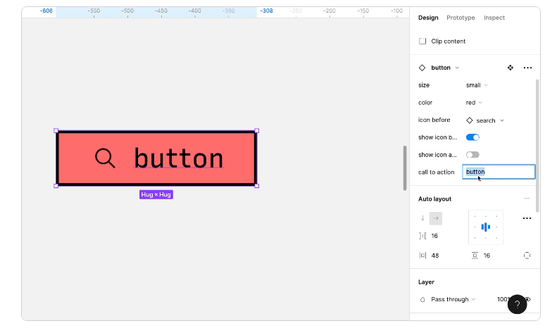
Create Text Layers
Select the Text Tool by pressing the T key or clicking the ‘Text’ icon in the toolbar. Click on your canvas where you want the text to appear or drag to define a specific text box size.
Adjust the text properties to align with your project’s design aesthetics:
- Font Size: Ensure readability, especially for key action elements.
- Font Weight: Use bold or regular styles to differentiate states (e.g., bold for active state).
- Text Color: Apply contrasting colors to make the text stand out. This is particularly useful for indicating different states.
- Alignment: Align text within its container to maintain consistency across your design.
Use predefined text styles if available to ensure consistency in the typeface application.
Guide to: Converting Figma Designs to HTML Code and Building a WordPress Website
Define States for Reaction Text
To use reaction text, it’s crucial to design the text components with various states:
Identify Necessary States: Consider common interaction states like:
- Default State: How does the text appear normally?
- Hover State: A visual indicator (perhaps a color or font change) that the text is interactive.
- Active State: Indicates a selected or clicked state, often involving a more dramatic style change or highlight.
Create Additional Text Layers for Each State: For each state, duplicate the original text layer and modify its properties to reflect the state’s purpose. Ensure all state variations of a text element are visually consistent but distinctly different to convey the current state clearly to users.
Group State Layers: Group related-text layers to maintain design organization. For instance, group all button text states into a single group titled Button Text. Use grouping to easily manage changes across all states, ensuring you can adjust positioning or styling collectively.
Know more: Best Tips and Tricks for Figma to WordPress Conversion
Use Naming Conventions
Naming conventions are essential for the ease of managing and transitioning between different text states.
Systematic Layer Naming: Start with a broader component name followed by the state. For instance, a button text could be named:
- Button-Default
- Button-Hover
- Button-Active
This methodical approach helps identify each text layer’s role and quickly set up interactions.
Consistency is Key: Maintain consistent naming across your project to facilitate collaboration and reduce confusion. Consistency aids in batch editing and applying changes across numerous elements when necessary.
Incorporate Descriptive Names: Use descriptive names to provide immediate context. Avoid generic terms, which could lead to ambiguity over time.
Top Picks: Best Figma to WordPress Conversion Tools
3. Creating Prototypes with Reaction Text in Figma
Prototyping in Figma allows you to transform static designs into interactive experiences. This is where your text components can truly come to life through dynamic interactions.
- Select the Interactive Element: Determine which UI element (such as a button, icon, or image) will initiate the text change when the user interacts with it. Click on the chosen trigger element to select it. This selection should be clear in the layers panel, ensuring you are linking the correct components.
- Enter Prototype Mode: Click on the ‘Prototype’ tab located in the upper-right corner of Figma’s interface. Here, you will find options to link interactions and preview them.
- Setup Interactions: Click and drag the blue circular connector (visible when an element is selected in Prototype mode) from the trigger element to the text layer that will change.
- Define Interaction Settings: In the interaction details panel on the right, specify the trigger event. For example, select ‘While Hovering’ if you want the text to change when the user hovers over the trigger. Choose the action to be performed, such as a change of text state or visibility toggle.
- Select an Animation Style: Choose an animation style like ‘Smart Animate’ to ensure smooth transitions between different text states. This style attempts to animate only the changes in properties (like position, opacity, and size), creating fluid interactions.
- Adjust Easing and Duration: Modify easing options to control the speed and manner of the transition. Common options include ‘Ease In’, ‘Ease Out’, and ‘Ease In and Out’. Set the duration of the animation. Shorter durations can feel brisk and responsive, while longer ones may suggest more deliberate actions.
Also read: Best Tips for Ensuring High Conversion Rates When Converting Figma Designs to WordPress
4. Testing Your Design
Comprehensive testing allows you to identify any issues and refine the interactions for optimal user experience.
Enter Preview Mode
To test your interactions, start by entering Preview Mode. Click on the ‘Present’ button at the Figma interface’s top-right corner. This launches a full-screen view of your prototype as users would experience it. In this mode, you can navigate through your design and interact with elements in a manner similar to real-world usage, providing a clear picture of how your transitions and interactions perform.
Observe User Interactions
In Preview Mode, interact with your design as a user would. Hover over interactive elements to see if the text responds correctly and all intended state changes occur. Pay close attention to the text’s transitions to ensure they align visually with your design goals.
Verify that each state (e.g., hover, active) appears as designed and that animations are smooth and considerate of interaction timing. This step helps catch visual inconsistencies and ensures the interaction design is both functional and aesthetically pleasing.
Iterate Based on Feedback
Finally, collect feedback from usability tests or directly from users if possible. User feedback is invaluable for identifying areas of confusion or elements that may not be as intuitive as intended.
Analyze these insights to make necessary revisions. This iterative process is crucial in refining interactions and improving overall usability. Adjust your design according to feedback to enhance user experience, ensuring that all interactions, including reaction text, are clear, engaging, and meet user needs effectively.
Design to Deployment Process: How to Use Figma Mockups for WordPress Development
Final Thoughts
Creating reaction text in Figma can significantly boost the interactivity and user-friendliness of your designs. By following the steps outlined in this guide, you can make your projects more engaging and efficient. Reaction text not only enhances user experience but also adds a layer of professionalism to your work.
As you continue to explore and refine your design skills, incorporating advanced elements like reaction text will become second nature. Figma’s powerful tools and features empower you to bring your ideas to life, ensuring your designs stand out online.
FAQs About Reaction Text in Figma
Can I create reaction text without coding in Figma?
Yes, Figma’s prototyping tools allow you to create interactive text elements without any coding. Its intuitive interface allows you to set up text interactions and animations seamlessly.
What are the best practices for creating reaction text?
Keep the text concise and clear.
Ensure the text color contrasts well with the background.
Use transitions to make reactions smooth and visually appealing.
Consistently test on various devices to ensure responsive design.
Can I use plugins to enhance reaction text in Figma?
Yes, Figma has a variety of plugins that can enhance interactive elements, including reaction text. Plugins can also aid in designing more complex interactions and animations.
How do reaction text and micro-interactions differ?
Reaction text is a form of micro-interaction. Micro-interactions refer to all small interactive design elements that engage the user, including button animations, icon transitions, and reaction texts.
Is Figma free to use for designing reaction text?
Figma offers a free tier that includes essential design and prototyping tools. For more advanced features and collaboration options for designers and developers, Figma provides premium plans.
How to make text clickable in Figma?
To make text clickable, switch to Prototype mode and draw a connection from the text element to the target frame or action. Set the interaction trigger to “On Click” to specify what happens when the text is clicked, such as navigating to another frame or changing a component state.
How to animate text writing in Figma?
To animate text writing, use Figma plugins like “Figmotion” or create frame-by-frame animations by duplicating the text (love, thanks, or question) and gradually revealing more characters in each frame. Then, set these frames in sequence to mimic the effect of text being typed out.
How to add text effects in Figma?
Select the text layer and use the right-hand panel to add effects such as shadows, blurs, or outline strokes. You can access text effects under the “Effects” section, where you can customize these options to achieve the desired visual style.
How do you write dummy text in Figma?
Use the “Figma Lorem Ipsum” plugin to insert dummy text quickly. Once installed, select the text layer where you want the dummy text to appear, run the plugin, and choose the amount or type of placeholder text needed for your design.