

Want to create flexible and scalable layouts in web design? One key way to achieve this is by mastering the conversion of PX to Rem units. If you’ve ever struggled to make your web designs more adaptable across different devices, then learning how to use Rem units can transform your approach and enhance user experience.
This article will guide you through understanding CSS units, focusing on Rem and Em units, and help you with Px to Rem conversion. You’ll also learn practical applications, best practices, and common challenges. Plus, we’ll cover exciting tools for conversion and design to streamline your workflow.
Understanding CSS Units
CSS units are the building blocks that define the size and spacing of elements on a web page. They play a critical role in how a site is displayed across various devices, directly affecting its usability and appearance. Understanding these units is essential for creating websites that are not only visually appealing but also functional and adaptable.

Types of CSS Units
This includes two types: Absolute Units and Relative Units.
Absolute Units: This is the most straightforward unit, including Pixels (px). A pixel is a fixed size relative to the display, making it easy to work with for precise layouts. However, because it doesn’t scale with screen size or user settings, it’s less ideal for responsive web design.
Relative Units: This includes two types:
- Rem (Root em): This unit is relative to the root element’s font size. It provides greater flexibility compared to pixels, allowing for designs that adapt across different screens without manual recalibration. When you adjust font size, it changes all rem-sized elements, which simplifies global scaling.
- Em: Similar to Rem, but Em is relative to the font size of the element it’s applied to or inherited from its parent. This is useful for nested elements as it allows for localized scaling based on the parent’s size.
User-Centric Design: Figma User Testing for WordPress Websites
Significance of CSS Units
CSS units are not just about defining dimensions; they embody principles of scalability, maintainability, and accessibility in web design. By choosing the right units, designers can ensure that their sites remain functional and visually cohesive across an array of devices and user preferences.
- Scalability: Using Rem units enhances scalability. As devices vary in screen size, Rem allows elements to automatically adjust. This helps maintain the aesthetic and functionality of the website across different viewports.
- Maintainability: Relative units like Rem and Em make code easier to maintain. A change in the base font size or any parent element size reflects throughout the design. This reduces the need for numerous adjustments and keeps the code clean and manageable.
- Accessibility: Rem units are particularly important for accessibility. They allow text sizes and element dimensions to increase or decrease with a user’s browser settings. This is crucial for accommodating users with visual impairments who may require larger font sizes for readability.
Know about: Best Font for Coding in Your Figma to WordPress Projects
The Limitations of Using Pixels (px)
While pixels are a default unit that has been traditionally used in web design due to their precision, they come with significant limitations that can hinder responsive and scalable design.
Here’s why relying solely on pixels might not be the best choice for flexible layouts:
- Non-Responsive and Scaling Challenges: Pixels are fixed in size, which means they don’t naturally adjust to different screen sizes or resolutions. This rigidity can lead to design elements appearing too large or too small on various devices, resulting in a suboptimal user experience.
- Accessibility and Readability Issues: Users with visual impairments often need the ability to scale text and elements. Pixel-based designs can be difficult to read if text does not scale with user preferences, potentially alienating users who require larger font sizes for better visibility.
- Complex Layout Adjustments: Crafting responsive sites with pixels often demands multiple media queries to handle different screen sizes and orientations. This need for extensive manual adjustment can complicate the design and development process, making it harder to maintain consistent layouts across a wide range of devices.
Learn: How to Design Brain-to-text Interfaces in Figma and Convert it to WordPress
Converting Px to Rem: Best Practices
Successfully transitioning from Pixels to Rem units can enhance the flexibility and scalability of your designs. Here are some best practices to guide you through Px and Rem units conversion process:
- Fixed Pixel Values for Media and Assets: Pixels still hold value for elements that require fixed dimensions, such as images or icons. These media assets often need precise sizing, making pixels an ideal choice to preserve their quality and integrity across different displays.
- Set Base Font Size in Rems: Establishing a consistent root font size using rems in the HTML or body tag sets a solid foundation for your design. This practice ensures that all rem-based elements scale proportionately, maintaining consistency and coherence throughout your site.
- Transitional Use: As you move from pixels to rems, convert key elements and components first. This gradual conversion allows you to test and adjust as needed, ensuring a smooth transition without disrupting your website’s visual layout.
- Embrace Relative Units for Long-Term Flexibility: Make a habit of using relative units like rems for sizing. This approach provides the flexibility needed to adjust designs effortlessly, especially as devices evolve and new screen sizes emerge.
- Nesting Elements with Em for Localized Scaling: Em units are particularly useful when dealing with nested elements. They allow for scaling based on the parent element’s font size, giving you more localized control over the appearance of child elements and maintaining the intended design hierarchy.
Check out: The Role of Atomic Design in Figma to WordPress Projects
How to Switch from Px to REM in Figma?
Transitioning from pixels (px) to rem units in Figma involves adjusting your design settings to better reflect how these designs will translate into web development. While Figma itself primarily supports pixels as a measurement unit, you can still prepare and guide your design approach to use rems and other units once your designs translate into CSS. Here’s how to do it:
1. Define the Base Size: Establish a base font size for your project, typically 16px, as this is the default size in most browsers. This will be the reference point for converting pixels to rems.
2. Convert Size Values:: To convert pixel values to rems, divide the pixel value by the base font size. For instance, if an element is 32px in Figma, it translates to 2rem in your CSS (32px ÷ 16px = 2rem).
3. Use Text Styles: Create text styles in Figma with names that include their intended rem size, e.g., “Heading 1 – 2rem” or “Body Text – 1rem”. This naming convention helps when translating these styles into your CSS.
4. Adjust and Label Components: For components that will be styled using rems, add annotations or notes within your Figma file specifying their rem conversion. This helps when handing off designs to developers or when converting them yourself.
5. Create Consistent Guidelines: Develop a design guideline or component library within Figma that includes the px-to-rem conversions. This ensures consistency and provides a reference point for designers and developers.
6. Translate Designs into Code: When moving from design to development, use your established base size to convert all pixel measurements in your design into rem units for your CSS.
7. Use CSS Variables: Consider using CSS variables for frequently used rem sizes, which can make adjustments and maintenance simpler in the future.
Know more: Is Figma Free for Your Design Needs
Creating a Comprehensive Guide to Rem Units
Mastering rem units is essential for designers aiming to scale dynamically and create flexible web designs. By understanding their use and practical application, you can enhance both the functionality and accessibility of your projects. Here’s how to use rem units for adaptable layouts, scalable typography, and modern web development:
- Utilize Best Practices: Following best practices ensure you maximize rem units’ potential. This includes setting a base font size in rems, using rems consistently across typography and layout, and applying relative units to achieve flexible designs. By adhering to these guidelines, you can create designs that look great and perform well on diverse devices.
- Explore Tools: Familiarize yourself with various tools to convert px to rem. These include online converters for quick calculations, browser DevTools for real-time adjustments, and CSS frameworks that integrate rem units naturally. By leveraging these resources, the transition becomes smoother and more efficient.
Find out: How to Translate Figma Mockups into WordPress Themes
The Benefits of Using Rem Units in Web Design
Transitioning from Pixels to Rem units comes with a host of advantages that can significantly enhance the adaptability and inclusivity of web designs. Here’s a closer look at why Rem units are so beneficial:
User-Centric Design and Accessibility
Rem units cater to user preferences by allowing text and element sizes to scale automatically with the user’s browser settings. This adaptability ensures that individuals with visual impairments or preferences for larger text can easily read content without manual adjustments, thus promoting an inclusive user experience.
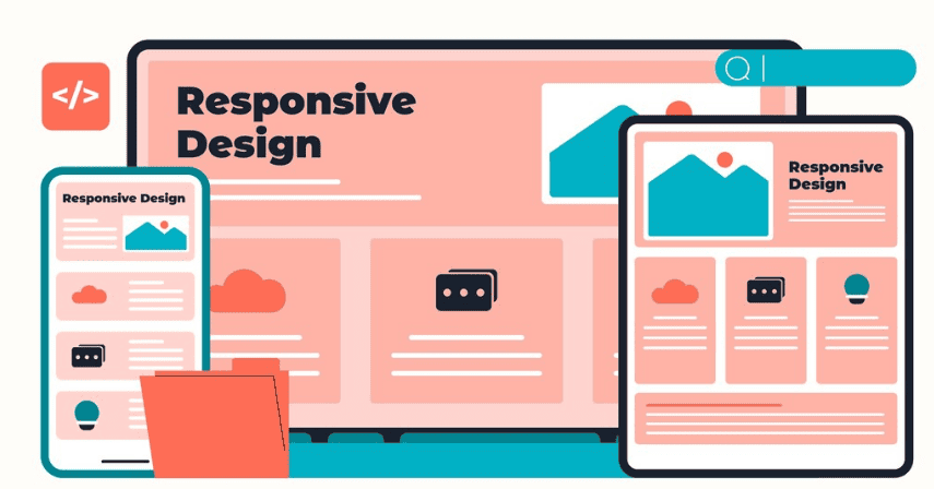
Ease in Responsive Design
Rem units simplify the process of creating responsive designs. By reducing the dependency on media queries for different screen sizes or resolutions, designs can automatically adjust, making the web development process more efficient and reducing potential errors from manual scaling.
Simplified Global Changes
With Rem units, a simple change to the root font size can ripple through the entire site, adjusting all elements appropriately. This ability to implement global styling changes helps maintain consistency across pages and reduces the workload when making design updates.
Consistent Visual Design
Rem units naturally align with visual design systems such as grid layouts, columns, and modular scales. This consistency helps maintain a coherent visual rhythm throughout the site, ensuring that spacing, typography, and elements are proportionate and harmonious, regardless of the device or screen size.
Best Practices for Rem Units in CSS
Adopting best practices is crucial to implement rem units in your web designs effectively. These practices ensure your designs are scalable, flexible, and accessible across a wide range of devices and user preferences. Here are key strategies to maximize the use of rem units:
- Use Rem for Scalability: Rem units should be the go-to choice for scaling elements like typography and main layout components. By setting font sizes and spacing with rem, you ensure that elements scale consistently based on the root font size. This approach enhances both scalability and accessibility, making sure your designs remain usable on any device or screen size.
- Em for Localized Scaling: Use Em units for elements within components where localized scaling is needed. Em units scale relative to their parent element’s font size, making them ideal for nested elements where you want precise control over sub-element sizes, such as padding or spacing within a module.
- Limit Px Usage: While pixels provide precision, excessive use can hinder adaptability. Limiting pixel usage to specific use cases like fixed-size media ensures your design maintains its responsiveness and flexibility. For other elements, prefer using rem or em to promote a more dynamic layout.
- Test Regularly: Regular testing is vital to confirm that your design responds well across different devices and settings. Use responsive design tools and adapters to simulate various screen sizes, checking that the rem-based elements adjust appropriately without breaking the layout or user experience.
Complete Guide: How to Seamlessly Embed Figma into WordPress Site
Understanding Em Units and Font Size
Em units enable fine-tuned control over design elements while keeping the relationship between components consistent. By leveraging Em units, web designers can create dynamic, scalable web pages that maintain their intended appearance across various display settings and device types.
Here’s a deeper look into why em units are beneficial:
- Relation to Font-Size: Em units are inherently tied to the font size of the parent element they are applied to. This relationship means that if the font size of the parent changes, all Em values scale proportionally. This characteristic is particularly useful for creating adaptive component sizes without needing explicit media queries for every possible configuration.
- Flexibility in Design: Em units offer significant flexibility when used for properties like padding, margin, or font size. Since they adjust according to the parent element’s styles, em units allow designers to maintain consistent visual proportions within nested structures. This capability is advantageous in modular design systems, where components need to adapt fluidly to different layouts and contexts.
Also read: Best Techniques and Strategies for Responsive Design in Figma
Choosing the Right Unit for Your Web Design Project
Selecting the appropriate CSS unit ensures that your web design meets its functional and aesthetic objectives. The choice of unit can significantly affect the site’s consistency, user experience, and alignment with design goals. Consider the following when making your decision:
- Consistency: Consistency across different devices is crucial. Selecting units like rems, which ensure that elements scale proportionally, helps maintain a uniform look and feel. This choice contributes to a cohesive user experience, regardless of the device being used.
- User Experience: To enhance user interaction, prioritize units that improve both accessibility and scalability. Rem units, for example, allow text and layout elements to adapt to user preferences and display settings. This makes the website more accessible to a wider audience, including those with visual impairments.
- Project Goals: Aligning your choice with the project’s overarching design goals ensures that the final product meets both functional and aesthetic standards, whether it’s for creating responsive layouts or maintaining pixel-perfect precision for certain elements.
Further reading: The Impact of Color Theory in Figma to WordPress Conversions
Design Systems and Media Queries
In modern web design, design systems and media queries are indispensable tools that help maintain consistency and responsiveness across digital products. Understanding their roles can enhance efficiency and cohesiveness in your design process:
- Reusability: Design systems are structured collections of reusable components and standards that ensure consistency throughout a website or application. By implementing a design system, you can maintain a uniform look and feel, making development faster and more efficient. These systems provide predefined styles and elements that can be reused across various parts of the project, streamlining the design process and reducing redundant work.
- Simplified Media Queries: Media queries are essential for applying different styles according to device sizes and orientations. However, using Rem units can simplify this process significantly. By defining layouts and typography with Rems, you can reduce the number of device-specific queries needed. This is because Rem units naturally adapt to changes in the root font size, facilitating flexible design that automatically scales across different screens without the need for extensive media query definitions.
Tools for Px to Rem Conversion and Design
By incorporating these tools into your design process, you can efficiently manage px to rem conversions and ensure your projects are responsive, scalable, and aligned with modern web design best practices.
- Online Px to Rem Converters: These tools are excellent for swiftly converting Px values to Rem. Simply input the pixel value and the base font size to get the equivalent rem value. These tools help you transition designs from pixels to rems without manual calculations, saving time and reducing errors in the conversion process.
- Browser DevTools: Available in browsers like Chrome, Firefox, and Edge, Browser DevTools allow you to inspect and modify CSS styles in real time. This feature is invaluable for testing how changes from pixel to rem units affect the layout and appearance of your web pages, enabling on-the-fly adjustments and refinements.
- CSS Frameworks: Frameworks like Tailwind CSS inherently utilize rem and em units, making it easier to implement responsive designs. These frameworks provide predefined classes based on relative units. This allows designers to apply consistent styles quickly and ensures that design elements scale correctly across different devices.
Conclusion
Mastering the transition from Px to Rem in web design unlocks the potential for creating more responsive, scalable, and accessible sites. By understanding both the benefits and challenges of rem units, designers can enhance user experience across devices. As a next step, start implementing rem units in your projects, utilize tools for smooth conversions, and continuously refine your design process to cater to a diverse audience.
FAQs About Px to Rem
How do you convert px to REM function?
To convert Px to Rem, use a simple calculation: divide the pixel value by the root font size (usually 16px) to get the rem value.
Why should designers move from px to rem?
Unlike Px, Rem units allow designs to be more flexible, accessible, and scalable across different devices.
Should you use REM instead of Px?
Generally, yes. Using REM units enhances scalability and consistency, especially in responsive design.
How do you switch from Px to REM in Figma?
Adjust your design’s typography settings to use Rem units, reflecting these changes in CSS for web use.