

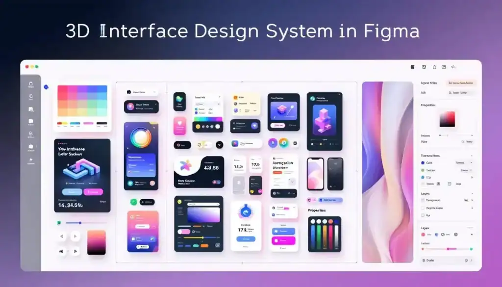
Designing consistent and scalable user experiences is no easy task, especially when interfaces must adapt across multiple screen sizes, devices, and even immersive 3D environments. Whether you’re working solo or collaborating within a large design team, keeping layouts, spacing, and alignment in sync can quickly become overwhelming. This is where Figma’s Spatial Design System steps in.
By setting predefined rules for spacing, depth, and alignment, it ensures that every element feels cohesive, regardless of the platform. From mobile apps to AR/VR interfaces, a spatial system helps teams maintain clarity, improve collaboration, and scale their designs with confidence.
What is a Spatial Design System in Figma?
A Spatial Design System in Figma is a structured framework of principles, components, and guidelines created for designing three-dimensional (3D) interfaces.
Unlike traditional 2D design systems, it focuses on building immersive experiences for AR and VR environments, where depth, scale, and user movement play a critical role.
This system combines familiar UI elements, such as buttons, menus, and navigation, and is adapted for 3D spaces with modular components and global styles. By doing so, it ensures designers can maintain cohesion and scalability while creating interfaces that feel both intuitive and immersive.
Within Figma, these spatial systems help teams rapidly prototype, iterate, and collaborate on designs that blend the physical and digital worlds.
Key Benefits of Using Figma’s Spatial Design System
Designing for 3D environments comes with unique challenges, and Figma’s Spatial Design System addresses them effectively.
- Immersive Consistency: The system ensures consistent depth, spacing, and scale across 3D interfaces, making experiences feel natural and cohesive.
- Faster Prototyping: By leveraging reusable 3D-adapted components and variables, teams can build prototypes quickly without starting from scratch for each screen size or interaction.
- Cross-Platform Scalability: Spatial design tokens allow interfaces to adapt seamlessly across different devices and screen sizes, from AR headsets to VR platforms.
- Better Collaboration: Because Figma is cloud-based, designers and developers can work in real time, communicate status updates, and align on design files efficiently.
- Enhanced User Experience: A spatial system supports more intuitive, human-centered interactions by accounting for user movement, perspective, and depth.
Turn Your Spatial Designs into Digital Magic
From 3D-ready layouts to pixel-perfect components, we ensure your immersive designs translate seamlessly into the digital experience your users deserve.
How Teams Apply Spatial Design in Real Projects?
Let’s take a practical example: Imagine a team creating a VR-based learning application. Instead of manually designing every 3D interface, they use Figma’s spatial tokens and modular components.

For example, menus and buttons are adapted for depth and placed within a user’s field of vision, while scaling rules ensure they remain legible across different screen sizes and headsets.
Key Outcomes of Applying Spatial Design
- Consistent Depth and Scale: 3D elements retain proportion and hierarchy across AR/VR modes.
- Efficient Collaboration: Designers and developers work from the same design files, easily communicating status and updates in real time.
- Cross-Device Adaptability: The same design scales smoothly from VR headsets to AR overlays.
- Time Savings: Using reusable 3D components reduces manual adjustments and accelerates prototyping.
This consistency can save hundreds of hours for enterprise or large-scale projects, while delivering user experiences that feel natural and immersive.
Simple Steps: How to Use Figma for Product Design
Competitor Analysis: Figma vs Other Tools
While Figma is leading in collaborative 2D-to-3D workflows, other tools like Unity UI, Sketch, and Adobe Aero specialize in immersive design environments. Here’s how they compare:
| Feature | Figma (Spatial Design) | Unity UI | Adobe Aero | Sketch |
| Spatial Tokens | Yes, adaptable for 3D via design variables | No native tokens; uses manual setup | No tokens, asset-based workflow | Limited, 2D only |
| 3D Interface Support | Basic, prototyping focus | Full 3D environment, highly customizable | 3D/AR scenes with limited complexity | None (2D only) |
| Collaboration | Real-time, cloud-based | Version control via Git, not real-time | Limited collaboration, file-based | Plugin-based, not seamless |
| Component Libraries | Scalable, modular | Prefabs (reusable game objects) | Asset-driven, less modular | Strong, but only in 2D |
| Cross-Platform | Browser + Desktop | Cross-platform (mobile, PC, VR/AR devices) | Mobile + desktop (limited AR devices) | macOS only |
| Developer Handoff | Integrated (Figma Inspect) | Direct integration into Unity projects | Exports into Adobe ecosystem | Requires Zeplin/Plugins |
| Learning Curve | Easy for designers | Steeper, developer-focused | Moderate, design-tool friendly | Easy for 2D designers |
Best Practices for Implementing Spatial Design in Figma
Designing for spatial interfaces goes beyond arranging elements on a flat screen. It requires careful consideration of depth, scale, user movement, and accessibility.
To fully leverage Figma’s Spatial Design System for AR/VR or 3D experiences, teams should follow a set of best practices that ensure consistency, usability, and scalability.
- Define Spatial Tokens Early: Start by creating a set of spacing and depth tokens that represent distances in 3D space. For example, define increments for object separation (0.25m, 0.5m, 1m) just as you would with 4px or 8px scales in 2D.
- Use Modular Components: Adapt familiar UI patterns, buttons, menus, and cards, into 3D-ready modular components. This makes them reusable across different experiences while maintaining consistency.
- Document Interaction Rules: Clearly outline how users interact in different modes (AR, VR, or mixed reality). This includes gestures, gaze-based selections, or controller interactions.
- Collaborate Closely with Developers: Spatial design relies heavily on technical feasibility. Align design files and variables with developers early so spacing, lighting, and interaction cues translate smoothly into software.
- Test Across Devices: Always validate designs on different screen sizes and headsets. A layout that feels natural in one VR headset may feel overwhelming in another.
Learn: How to Use Figma Templates for Your Design Projects
Bonus: Core Elements of a Robust Design System
A design system is more than a collection of components; it’s a holistic framework that reflects brand values, empowers collaboration, and ensures consistent user experiences. To build a system that truly scales, teams must consider several foundational elements.
Principles of Product Design
At the heart of every design system are its principles; the “why” behind design decisions. These principles are not just abstract ideas; they capture the company’s values, mission, and brand identity, ensuring that all design work aligns with a unified vision.
When clearly defined, principles help teams make better decisions, resolve conflicts, and maintain consistency across different products and platforms.
Strong principles should be simple, actionable, and easy to communicate. Instead of being lofty ideals, they must be practical enough to guide day-to-day design choices.
The best principles often emerge from real patterns and workflows already present within the organization. Key aspects of design principles (ACCP) are:
- Alignment: Ensure teams share the same vision and direction.
- Conflict Resolution: Provide a framework for decision-making when trade-offs arise.
- Consistency: Create cohesive experiences across platforms and teams.
- Practicality: Remain clear, actionable, and directly applicable to design work.
Explore: How to Use AI Tools in Figma Design for Stunning Results
Product Design Considerations
When building a Figma design system, it’s essential to factor in product design considerations that balance user needs with company goals. A successful system goes beyond aesthetics; it must support usability, flexibility, and brand alignment.
Designers should analyze how users interact with products, while ensuring the design system remains adaptable to different use cases and evolving business needs. Key considerations include:
- User Needs: Prioritize user goals, behaviors, and pain points.
- Flexibility: Ensure the system adapts across devices and product types.
- Brand Alignment: Reflect company values and visual identity.
- Scalability: Support both current and future product growth.
Learn about: E-Commerce Product Pages with WordPress and Figma
Foundations of Design
The foundations of design are the building blocks of any design system. They define the reusable styles and elements that ensure consistency across every product.
By setting strong foundations, teams reduce guesswork, speed up design decisions, and create scalable systems that can adapt to different platforms.
These foundations typically include colors, typography, grids, and spacing, but can also extend to interaction patterns and design tokens. Key aspects of foundations are as follows:
- Visual Styles: Define consistent use of color, typography, and imagery.
- Design Tokens: Standardize spacing, sizing, and components for reusability.
- Patterns: Establish common interaction behaviors like buttons, forms, and navigation.
- Consistency: Ensure products feel cohesive across screens and devices.
Find out: How to Convert Figma to Gutenberg
Accessibility in Design
Accessibility ensures products are usable by everyone, including people with permanent, temporary, or situational disabilities.

A design system that embeds accessibility from the start promotes inclusivity and scalability, helping teams avoid costly redesigns later. It also aligns with global standards and ensures that no users are excluded or alienated. Key aspects of accessibility are:
- Inclusivity: Design for diverse user abilities and contexts.
- Scalability: Make accessibility rules part of the system to scale across teams.
- Compliance: Align with accessibility standards (WCAG, ADA).
- User Experience: Improve usability for all, not just users with disabilities.
Discover: How to Design Brain-to-text Interfaces in Figma and Convert it to WordPress
Iconography and Elevation
Icons and elevation play a vital role in reinforcing brand identity and guiding users through interfaces. A clear icon system ensures recognizability, while consistent elevation provides hierarchy and visual feedback.
When applied correctly, these elements improve usability and prevent confusion. Key aspects of iconography and elevation include:
- Icon Styles: Define consistent approaches (flat, line, 3D, or illustrative).
- Clarity: Keep icons recognizable without excessive abstraction.
- Hierarchy: Use elevation to separate layers and emphasize importance.
- Feedback: Elevation highlights interactions, improving user engagement.
Guide to: Converting Figma Designs to HTML Code and Building a WordPress Website
Building a Design Team
A strong design system is never built in isolation; it requires collaboration across disciplines. While many systems start with a single advocate, scaling requires input from designers, developers, and product managers.
Each role brings unique insights: designers ensure usability, developers provide technical feasibility, and product managers align the system with business goals.
A well-balanced team fosters ownership, reduces silos, and ensures the system evolves to meet real product needs. Key aspects of building a team:
- Cross-Disciplinary Collaboration: Involve design, development, and product management.
- Advocates: Start small with passionate team members to drive adoption.
- Technical Feasibility: Lean on developers for scalable, maintainable solutions.
- Shared Ownership: Encourage input from all stakeholders for long-term success.
Read: Best Tools to Convert UI to Code
Naming Conventions
Clear naming conventions make design system elements easy to find, apply, and maintain. Semantic names, such as “primary” or “danger” for colors, remove ambiguity and support consistent usage.
Structured naming reduces confusion, especially in large teams, where multiple designers and developers interact with the same components. A logical approach enhances communication and helps avoid misuse. Key aspects of naming conventions:
- Semantic Clarity: Use names that describe purpose, not just appearance.
- Structure: Follow patterns like Category / Use / Variation.
- Consistency: Apply the same format across all design tokens.
- Efficiency: Improve searchability and reduce mistakes in implementation.
Tops Picks: Best Figma to WordPress Conversion Tools
Naming Conventions Alternatives
Beyond structure, the format of naming plays an equally important role, especially during developer handoff. Choosing between camelCase, snake_case, or kebab-case depends on the programming environment, but consistency across the system is crucial.
Aligning with development teams ensures smoother collaboration and easier integration. Key aspects of naming alternatives are:
- Format Choice: Pick a case style (camelCase, snake_case, kebab-case).
- Developer Alignment: Match naming to engineering tools and workflows.
- Consistency: Apply the same case style across all components.
- Integration: Reduce friction during development and maintenance.
Check out: Best Page Builders for Figma to WordPress Conversion
Design System Implementation
Implementing a spatial design system requires both strategic planning and cross-team collaboration. The system should reflect company goals, values, and brand identity while remaining flexible enough to evolve with the team’s needs.
Successful implementation goes beyond building components; it requires defining reusable patterns, guidelines, and clear documentation.
Stakeholders across design, engineering, and product should be actively involved to ensure adoption and long-term success. Key aspects of implementation are:
- Strategic Alignment: Tailor the system to the company’s goals and brand identity.
- Reusable Components: Provide scalable building blocks for teams.
- Clear Guidelines: Document standards for consistency and ease of use.
- Collaboration: Involve designers, developers, and stakeholders in rollout.
What’s Best: Figma to WordPress Automation vs Professional Services
Maintaining a Design System
A design system isn’t a one-time project; it requires continuous improvement. As business goals, branding, and technology evolve, the system must adapt.
Regular updates ensure the system stays relevant, scalable, and aligned with the company’s direction.
By monitoring usage and collecting feedback, teams can refine components, add new patterns, and maintain user-centered design. Key aspects of maintaining a design system include:
- Regular Updates: Reflect changes in goals, branding, or technology.
- Performance Monitoring: Track how well the system supports design workflows.
- Flexibility: Allow room for new ideas and innovations.
- Sustainability: Dedicate ongoing effort and resources to upkeep.
Find out: How to Use Figma Components in WordPress Theme Development
Conclusion
The Spatial Design System in Figma isn’t just a design trend; it’s a framework that transforms how teams collaborate, scale, and ship products. From startups to enterprise-level applications, spatial design ensures:
- Consistency across screens
- Faster collaboration between designers and developers
- Reduced errors and faster time to market
When compared with tools like Sketch, Figma’s native spatial system and real-time collaboration features make it the go-to choice for design teams worldwide.
FAQs About Spatial Design System
How does a design system adapt to different screen sizes?
A design system uses responsive layouts and variables to ensure that components adjust seamlessly across different screen sizes, from mobile to desktop.
Why are design files important in a design system?
Design files serve as the single source of truth, allowing teams to communicate status, share updates, and maintain consistency across projects.
In what ways can designers access software modes for collaboration?
Designers can access software in different ways, including presentation mode, prototype mode, and edit mode, each supporting collaboration across world course projects.
How do variables improve design system workflows?
Variables allow teams to define values, such as spacing, colors, or typography, once and reuse them across design files, making it easier to maintain consistency while reducing manual effort.