

Migrating to a new design tool is no small feat, especially when it involves a critical part of your digital product strategy like a design system. For many teams, Figma has emerged as a powerful solution thanks to its collaborative features, flexibility, and ability to scale. However, moving an entire design system to Figma requires careful planning, team alignment, and a strategy rooted in best practices.
This article will walk you through how to successfully migrate to Figma, the benefits you can expect, and best practices to ensure the transition enhances, not disrupts, your design and development workflows.
Whether you’re switching from Sketch, Adobe XD, or another tool, this guide will help you avoid common pitfalls and make the most out of your move to Figma.
What is a Design System?
A design system is a collection of reusable UI components and related standards. These systems are used across product teams to maintain consistency in design and improve collaboration between designers and developers.

But it’s not just about buttons and colors. A strong design system supports branding, accessibility, and scalability, ensuring that every new product or feature aligns with the broader design and development strategy.
When migrating to a new tool like Figma, your design system becomes the foundation of your transition. That’s why thoughtful planning is essential.
Need Help Migrating to Figma Design System?
Our team of Figma experts will help you build a scalable, efficient, and future-ready design system that empowers your entire product team.
Why Migrate to the Figma Design System?
Figma has quickly emerged as a preferred design tool for modern teams, and it’s easy to see why. It’s more than just a UI design tool; it’s a collaborative platform that brings design, development, and product teams together in real-time.
Migrating to Figma can streamline your workflows, boost productivity, and enhance design consistency across projects. Here’s a closer look at the key reasons to migrate to Figma:
Real-Time Collaboration
Figma eliminates the traditional barriers to collaboration. Multiple team members (designers, developers, product managers) can edit, view, or comment on the same file simultaneously, all without overwriting each other’s work. This means:
- No more emailing static files or managing version conflicts.
- Stakeholders can give feedback directly in the design file.
- Faster decision-making during design reviews or sprints.
This real-time collaboration significantly shortens design cycles and fosters better alignment across teams.
Cloud-Based and Easily Accessible
Figma is fully cloud-based, which means:
- No need to install or update software manually.
- Designs are always backed up and accessible from anywhere. This is perfect for distributed or remote teams.
- Updates and changes sync instantly for everyone.
Additionally, Figma offers a lightweight desktop app for those who prefer a native experience, but its browser-based functionality ensures maximum flexibility.
Expert Picks: Best Page Builders for Figma to WordPress Conversion
Powerful and Scalable Component System
One of Figma’s strongest features is its component system, which allows you to:
- Create reusable UI elements that maintain consistency across products.
- Build variants for different states (like hover, disabled, active).
- Use auto-layout to make designs responsive and adaptable to content changes.
This modular approach not only makes your design system more efficient, but also ensures seamless handoff to development by maintaining design integrity throughout.
Robust Plugin Ecosystem
Figma has a vibrant and growing plugin community. With hundreds of free and premium plugins, you can automate repetitive tasks, improve accessibility, manage icons, handle localization, and much more. These plugins save time and ensure that your designs are polished and production-ready.
Cross-Functional Integration
Figma integrates effortlessly with tools that product and engineering teams already use, including:
- Jira to link designs to tickets or user stories.
- Zeplin and Avocode for smoother design-to-dev handoff (if needed).
- GitHub to sync design changes with code repositories.
- Slack for real-time notifications and feedback loops.
These integrations allow for a more connected workflow and ensure that design isn’t siloed from the rest of the product development process.
Know more: Top Figma-Friendly WordPress AI Website Builders
Migrating to Figma from Sketch, Adobe XD, or Other Tools
Each design tool has its own strengths and quirks. That said, Figma offers import functionality and third-party plugins to help with file transfers. Still, a clean migration goes beyond copying and pasting.
- Convert or Rebuild: In some cases, rebuilding components in Figma is more efficient than converting them. Rebuilding also ensures you’re fully utilizing Figma’s features like auto-layout and variants.
- Component Mapping: Identify how components from your old tool map to Figma’s system. This includes understanding how symbols in Sketch translate to Figma components and variants.
- Preserve Design Tokens: Ensure colors, typography styles, and spacing tokens are clearly defined and documented. These can be recreated in Figma using variables.
- Train Your Team: Offer hands-on workshops, documentation, and plugin recommendations. The goal is to shorten the learning curve and promote adoption.
Migrating to Figma Design System: Best Practices to Follow
Migrating your design system to Figma is a strategic move that can significantly improve team collaboration, design consistency, and workflow efficiency. However, a smooth transition requires thoughtful planning and execution. Below is a set of best practices to help you navigate the migration process.
1: Preparing for Figma Migration
Before jumping into Figma, preparation is key. A rushed or unplanned Figma migration often leads to broken components, frustrated teams, and messy file structures.
- Audit Your Current Design System: Start by assessing your existing assets. Which components are outdated? Are there any inconsistencies in usage? Understanding what you currently have helps you identify what should be rebuilt, migrated, or discarded.
- Define Objectives: Clearly define your migration goals. Are you aiming for improved collaboration? Better scalability? Cleaner file structure? This clarity will guide your strategy.
- Establish a Cross-Functional Team: Include members from design, web development teams, and product management. Each brings a unique perspective, which helps ensure a smooth transition and better alignment post-migration.
- Create a Migration Plan: Break your migration into phases, such as setting up your Figma workspace, migrating components, updating documentation, and training your team.
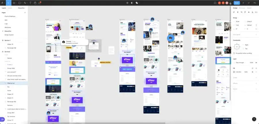
2: Organizing Design Files in Figma
A well-organized file structure is essential for collaboration, scalability, and long-term maintainability.
In a shared design environment like Figma, how you structure files, components, and pages directly impacts how easily your team can work together and maintain consistency across products. Here’s how to structure your Figma workspace:
Create a Design File Hierarchy
Start by grouping your files into logical folders within Figma Teams and Projects. A structured hierarchy makes it easier to locate files and manage access. For example:
- Team: Design Team
- Project: Product A
- Files: Product A – UI Kit, Product A – Homepage, Product A – Dashboard
Use a consistent naming convention across files like:
[Product] → [Feature/Module] → [Purpose]
This makes navigation intuitive and helps new team members onboard quickly.
Use Libraries for Shared Components
Figma allows you to create shared libraries where components, styles, and variables live. By centralizing these assets, you ensure that:
- All design teams are working from the same source of truth.
- Updates to components automatically reflect across all linked files.
- Inconsistencies are minimized across design projects.
Create separate libraries for UI components, icons, patterns, and brand elements for better organization and version control.
Use Clear Naming Conventions
Consistent naming is key to discoverability and reuse. Instead of vague labels like button1 or style-new, use descriptive, structured names such as:
- Components: btn/primary/default, form/input/error
- Text Styles: heading/h1/desktop, body/regular/small
- Colors: color/primary/500, color/background/light
This clarity helps both designers and developers understand purpose and hierarchy at a glance.
Utilize Page Structure Wisely
Each Figma file can contain multiple pages. Use them to separate different types of content for better organization. A common page structure includes:
- Cover Page: Overview or file guide
- Documentation: Usage guidelines and specs
- Components: Master components and assets
- Templates: Layouts or screens for reuse
- Playground: A space for experimentation or design exploration
This setup reduces visual clutter and makes it easier to locate what you need without digging through a single chaotic canvas.
Read more: Best UI/UX Design Trends
3: Discovering Human Stories and User Needs
A design system is only as strong as its relevance to its users. While structure and components are essential, real user needs and team workflows should ultimately shape your system.
Designing in isolation can lead to misaligned solutions that hinder usability and adoption.
Here’s how to ensure your Figma design system is built around human-centered insights:
Conduct User Research
Before migrating or rebuilding components, take time to speak with the people who interact with your designs daily. This includes web designers, developers, product managers, and even end-users. Explore:
- What frustrates them about the current system?
- Where do they see inconsistencies or inefficiencies?
- How do they typically interact with components or templates?
These insights can uncover gaps in usability, flexibility, or accessibility that may not be obvious from the design side alone. This foundational research ensures your design system solves actual problems, not just aesthetic ones.
Collect Feedback Continuously
Design systems are living products. Rather than waiting until post-launch to gather feedback, build it into the migration process. Use Figma’s built-in commenting, version history, and sharing capabilities to:
- Invite team input as components are built or improved
- Encourage async reviews and contextual discussions
- Make feedback loops visible and easy to manage
Ongoing collaboration ensures the system evolves with team needs, rather than becoming outdated or rigid.
Document Use Cases Through Human Stories
Rather than designing abstract components in a vacuum, tie them to real-world use cases. For instance, a “button” component should include variations for:
- Primary vs. secondary actions
- Disabled or loading states
- Mobile responsiveness
- Accessibility features (like proper color contrast or focus states)
Document these use cases as “human stories,” a.k.a. brief scenarios that explain who is using the component, why, and how. This helps guide more thoughtful design decisions and ensures components are both functional and empathetic.
Find out: How to Create Wireframes in Figma
4. Building Scalable Components in Figma
One of Figma’s greatest strengths lies in its ability to create scalable, reusable components that grow with your product.
A well-structured component system not only speeds up design workflows but also ensures consistency across screens, teams, and platforms. Here are the key strategies to build smart, scalable components in Figma:
Leverage Auto-Layout
Auto-layout is essential for building components that are flexible and responsive. It allows components to adapt automatically to content changes, such as:
- Dynamic text in buttons or cards
- Adjustable padding and spacing in containers
- Responsive resizing for different screen sizes
For example, instead of creating multiple button sizes manually, use auto-layout to define consistent padding and let the button resize based on the label. This not only saves time but also reduces the number of components you need to manage.
Create Variants for State Management
Variants help you group similar components into a single, unified set. Rather than duplicating buttons for each state (e.g., default, hover, disabled), create one button component with variants. This keeps your library clean and improves usability. Use variants for:
- UI states (hover, focus, active)
- Sizes (small, medium, large)
- Themes (light, dark)
- Device adaptations (desktop, tablet, mobile)
You can also add properties and toggles, making it easy for designers to switch between states without breaking the structure.
Use Figma Variables for Global Control
Figma’s variables feature allows you to define and apply consistent tokens for color, spacing, typography, and more. This enables:
- Easier theming (e.g., switching between light and dark modes)
- System-wide updates with a single change
- Consistent spacing and alignment throughout your designs
For instance, instead of manually applying #1E90FF as a button color in multiple places, link it to a variable like color/primary/blue. When that value changes, all instances update automatically.
Document Component Usage Clearly
A scalable design system isn’t just about components; it’s also about educating your team on how to use them. Within the component page, include:
- Usage guidelines: When to use this component, and when not to
- Visual examples: Show correct and incorrect usage
- Link to dev documentation: Include links to Storybook, GitHub repos, or code snippets
This documentation empowers designers and developers to use components confidently and consistently, reducing guesswork and rework.
Simple Steps: How to Use Figma for Product Design
5. Tips for Design Teams During Migration
Migrating to Figma isn’t just a technical shift; it’s a cultural one. The way your team communicates, collaborates, and builds designs will evolve with the new system.
To ensure a smooth and successful transition, it’s important to adopt best practices that foster alignment, support, and continuous improvement. Here’s how design teams can navigate the Figma design system migration effectively:
Create Clear Guidelines
Establish a centralized set of design system standards and documentation. This should cover:
- Component creation rules (e.g., when to create a new component vs. reuse an existing one)
- Layer and component naming conventions
- Auto-layout and spacing rules
- File and folder structure
These guidelines act as a source of truth, helping designers maintain consistency and reducing the risk of fragmented design practices. Consider hosting this documentation directly within Figma or linking to an internal wiki or Notion page.
Encourage Feedback Loops
Create a structure for continuous team feedback, especially during the migration phase. Regular design critiques, retrospectives, or weekly check-ins can uncover:
- What’s working well in Figma
- Friction points or missing components
- Ideas for improvement
Figma makes this easier with real-time commenting and collaboration. Make it a habit to request and provide feedback directly in files to keep context intact and discussions actionable.
Invest in Onboarding
Whether your team is new to Figma or experienced, onboarding is crucial. Migration often introduces new workflows, so even seasoned designers need guidance. Provide:
- Interactive onboarding files that walk through the new system
- Video tutorials or walkthroughs
- Access to Figma’s learning resources and plugins
Make sure your onboarding materials evolve as the design system grows. Training documents should reflect new features, updated components, or changed naming conventions to keep everyone aligned.
Promote Cross-Team Collaboration
Successful migration isn’t just the responsibility of the design team. Involve product managers, developers, and stakeholders early in the process. Figma’s real-time collaboration capabilities allow everyone to:
- Review designs live
- Comment in context
- Understand component logic and constraints
Encouraging this kind of cross-functional engagement builds trust, improves design decisions, and reduces handoff issues. It also ensures the design system is built with everyone’s needs in mind, not just those of the UI designers.
Explore: How to Create a Stunning Website Mockup with Figma
6. Design Tools and Workflow Integration
While Figma is powerful on its own, its true potential is unlocked when it’s integrated into your broader product design and development ecosystem.
Whether you’re streamlining handoff, automating workflows, or enhancing productivity, connecting Figma with other tools ensures that your entire team moves in sync, from idea to implementation. Here’s how to make Figma work seamlessly within your workflow:
Connect with Development Tools
The design handoff shouldn’t feel like a broken telephone. Figma makes it easier by offering built-in developer specs like measurements, code snippets, and CSS properties right within the design files. However, for teams with more complex needs, integrating additional tools can bridge the gap further:
- Zeplin: Enhances handoff with custom specs, component organization, and documentation.
- Storybook: Connects live UI components with Figma designs to ensure visual consistency.
- GitHub/Jira: Link design files to development issues and track implementation progress.
This alignment helps eliminate confusion, reduce design debt, and keep product quality high.
Leverage Figma Plugins
Figma’s plugin ecosystem is vast and growing, offering tools that can drastically boost design efficiency and accuracy. Some must-have Figma plugins include:
- Content Reel: Quickly insert placeholder content, such as names, email addresses, and images.
- Unsplash: Add high-quality stock images directly into your designs.
- Design Lint: Automatically find and fix inconsistencies, such as missing styles or unaligned elements.
- Figmotion: Add motion design capabilities to your files, useful for prototyping animations.
These tools help automate repetitive tasks and maintain consistency across large teams and projects.
Use Figma’s API for Custom Workflows
For teams looking to go beyond the basics, the Figma API provides powerful ways to extend functionality and automate parts of your workflow. Use it to:
- Perform automated design audits
- Generate documentation from design files
- Sync component updates across multiple files or teams
- Track design system usage and health
By leveraging the API, you can build custom solutions that suit your unique needs, especially in enterprise environments where scale and efficiency are critical.
Discover more: How to Prepare a Figma File for WordPress Developers
Parting Thoughts
Migrating to Figma is more than a change in tools; it’s an opportunity to upgrade your entire design process. With its powerful features, real-time enhanced collaboration, and intuitive component system, Figma can transform how teams design, build, and scale digital products.
However, the transition must be approached strategically. From auditing your current system and preparing your team to organizing files and integrating feedback loops, each step contributes to long-term success.
By following the best practices outlined in this guide, you can ensure a smooth migration and build a more robust, collaborative, and scalable design system in Figma.